The Shopify homepage and supporting pages remained largely unchanged for many years. A fresh design and new content created a significantly better experience for leads and merchants.
My role: Content design lead, UX design partner, UX writer.
The situation
The homepage reflected a Shopify of several years ago. The secondary-level pages did the same, and the navigation teetered on irrelevance from too many tacked-on items over time.
The complication
Since the last site launch, the company’s audience changed, the positioning changed, and the marketplace itself changed. Stakeholders insisted on including their products in the nav. And some things were flat-out inaccurate. The old homepage looked like this dull and lifeless, lacking the vibrant tone we now wanted to share with the world:

The question
How can we update the site to better reflect the current product lineup, voice and tone, and overall brand experience?
The answer
With a combination of information architecture, user experience design, UX research, and content design mastery. (And lots of collaboration across disciplines.)
The process
My experience in this project was unique, as I returned to it in various phases when it required my consultation and expertise.
Phase one: This was the first thing I worked on at Shopify, starting in December 2020. The visual design, UX, and content design teams worked in close collaboration, exploring different concepts, different voice and tone variations, and different content hierarchies. The project was put on pause, and I started working on other projects.
Phase two: The project resumes, and I’m brought in to collaborate on the information architecture of the navigation in the summer of 2021. We explored variations of the hierarchy itself and refined the language used in the confined space of a mega menu nav.
Phase three: Final content design work was a flurry of activity on an extremely tight timeline. The page hierarchies were in place, but the final content crafting was still incomplete. I was brought in to help manage the final content design and approvals with leadership.
Over the course of one week, another content designer and I collaborated in an intense and truly rewarding sprint to craft the content from a nearly-blank slate.
The work
Navigation: We crafted a clear and concise mega menu nav, with clear pillars that reflect the merchant experience with the platform, updated to add new items and trim unneeded ones. Every character is put to good use.
Homepage: The new merchant-first positioning is on fully display. Active language communicates just enough information to help leads make the decision to take the next step and sign up for a free trial.
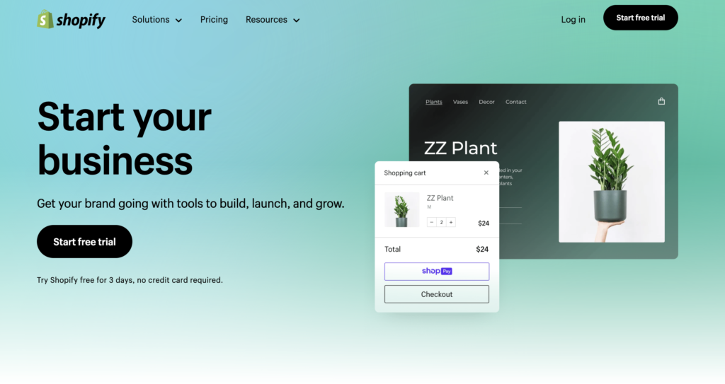
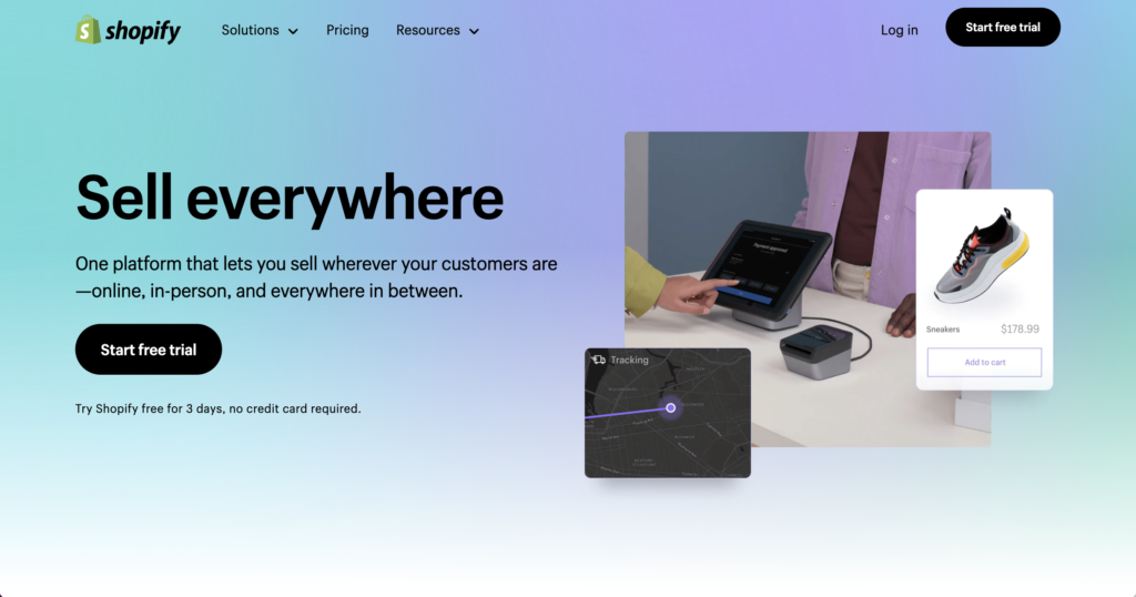
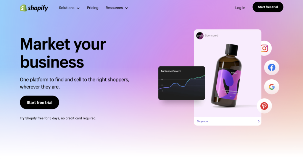
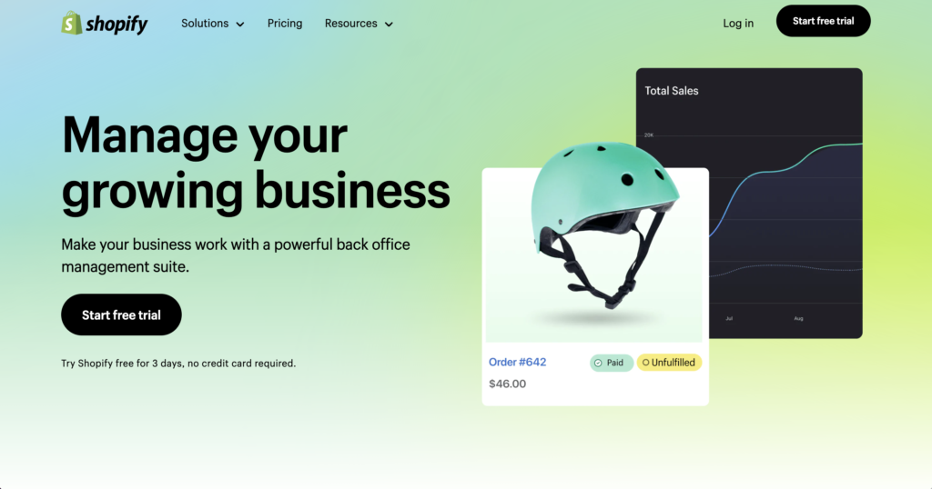
The four pillars: Each pillar page details key aspects of the Shopify platform. The content design work resulted in a finely-balanced presentation of features and benefits, concisely written with the busy merchant in mind.


The result
The work is live, today! This is an accomplishment in itself, as even a minor dip in performance can trigger a rollback to a safer, earlier version of the site. It continues to outperform and out-convert the old versions. (It looks great and reads very nicely, too.)

