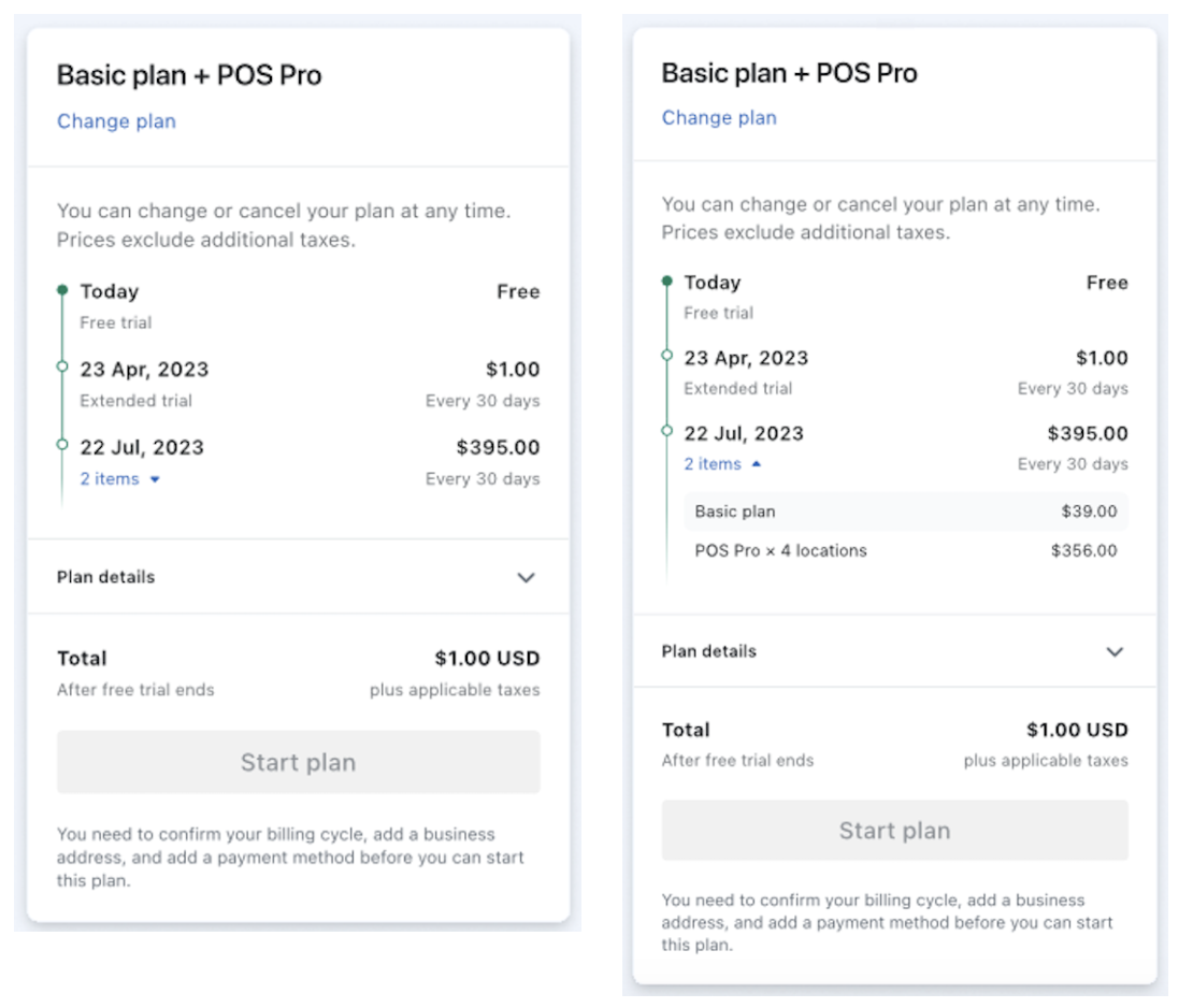
The merchant checkout was unclear, and we wanted to make it better. Too much copy formatted in an awkward way led to a confusing user experience. I helped untangle it from a UX and content design angle.
My role: Content design lead, UX design partner.
The situation
When a merchant checks out as a part of making a change to their plan subscription, they are presented with a summary, clearly showing what amount they will be charged and when it will happen.
The complication
This is an important summary, as it validates and confirms what their costs will be in the future. One wrong click or two and they could be charged several thousand dollars, as opposed to $5. The checkout works the same, no matter the amount.

The summary used to display all of the detail in a few lines of free text, quickly becoming complicated as more subscriptions get added. The lack of formatting made it as easy to read as a story problem in math class.
We also had different versions displaying in different places (i.e., mobile web, native, and desktop.)
The question
How can we make this critical part of the merchant experience more clear and easier-to-understand?
The answer
With a revamp that includes a timeline component to display the information in a simple, chronological fashion.
The process
Iteration was the name of the game for this project. We worked through dozens of variations in the content and user experience. None of the discarded versions were completed in vain – each moment we spent with the problem helped us think more clearly about it.
Like almost all projects at Shopify, the prototyping took place entirely in Figma. This common work area allowed us to collaborate in a live and equitable way, without anyone’s work languishing in a separate document.
The work
We took an untidy situation and made something that was scalable for future product and subscription additions.

The result
The merchant checkout improvements are live in the system today, bringing greater clarity and confidence for each merchant transaction.