Shopify: Cancelation flow

Merchants canceling their plans are sent through a flow that had provides them with limited options. Seeing this as an opportunity to get merchants on a more suitable plan, we created a new cancelation flow.

My role: Content design lead, UX design partner.

The situation

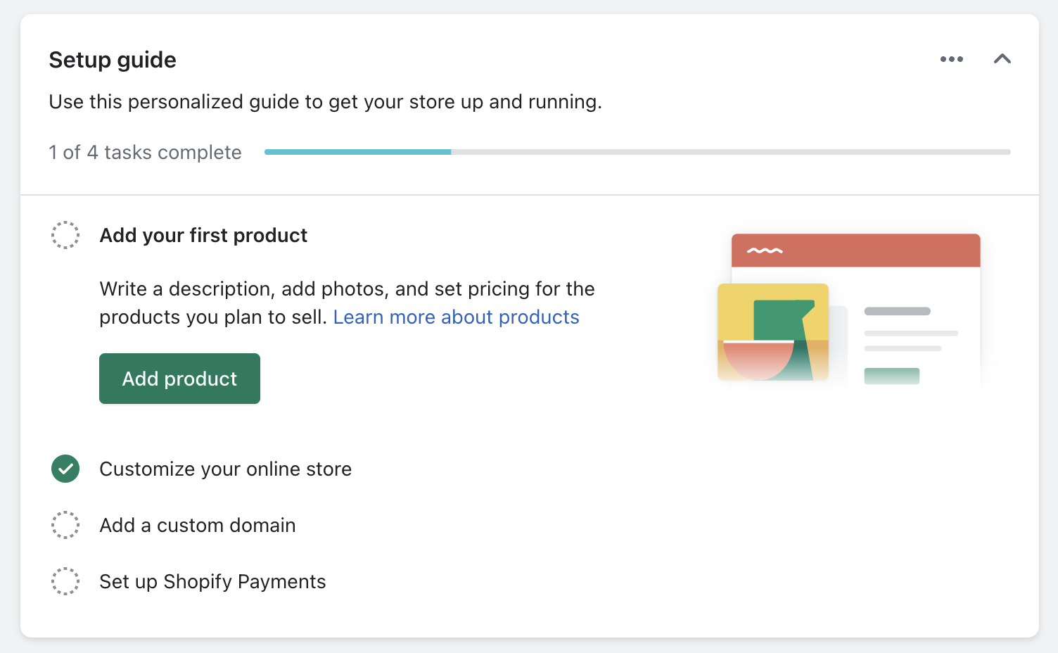
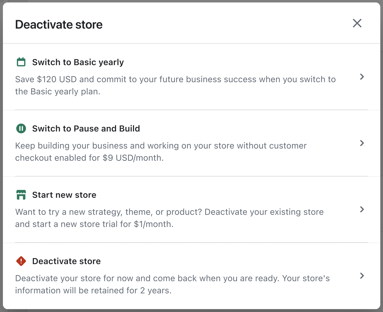
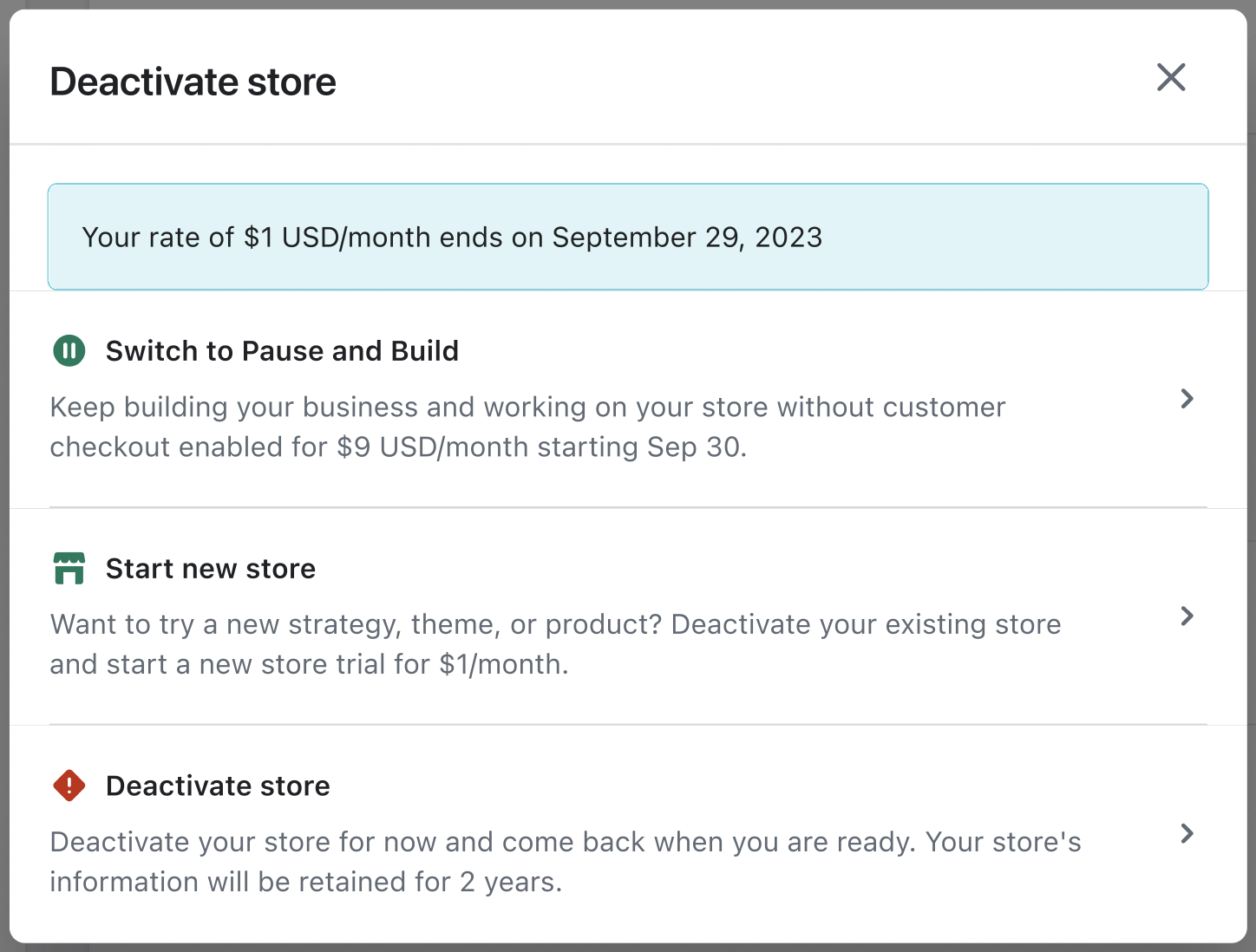
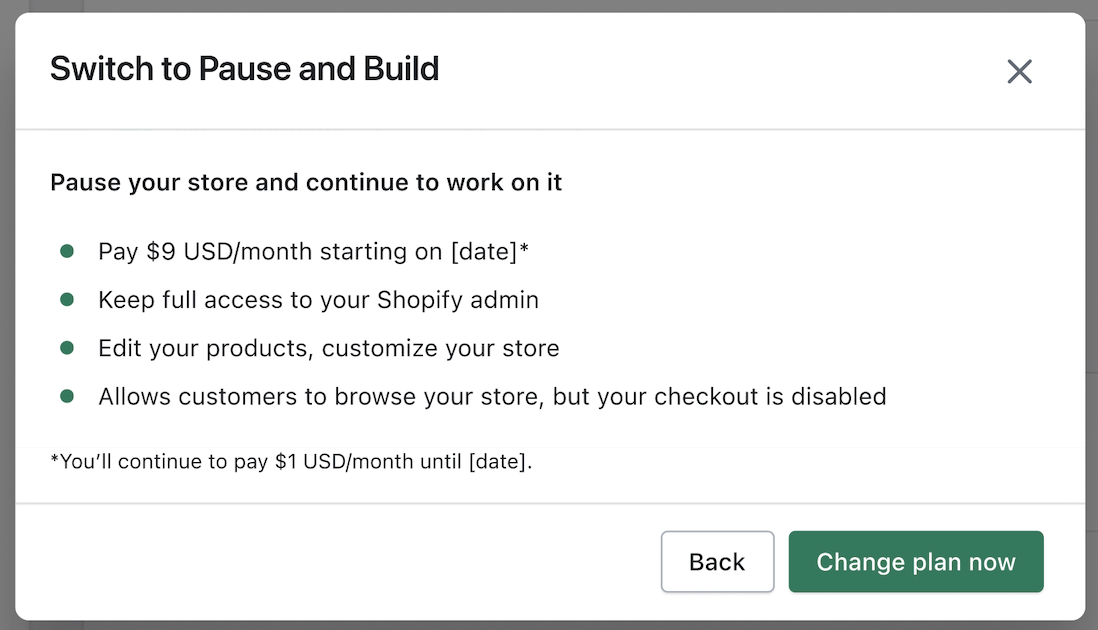
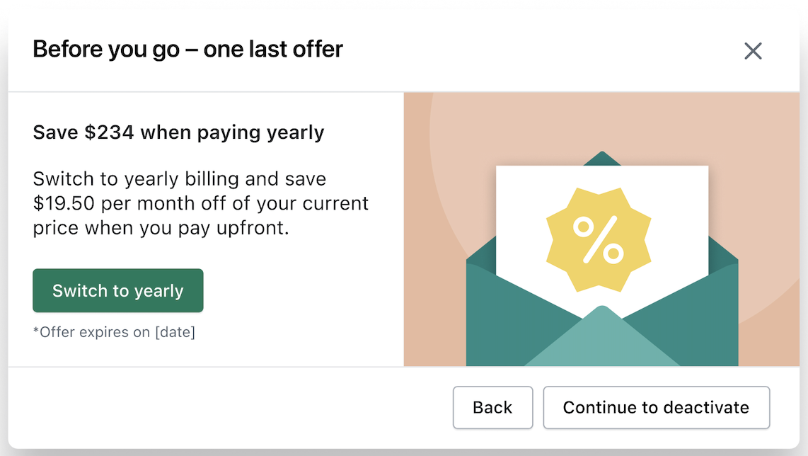
Shopify merchants cancel their plans for many reasons. Some may be on a plan that’s not right for them, and would choose to downgrade rather than cancelling, if the option is available to them. Others might select a different plan or choose the Pause and Build option, allowing them to keep working on a checkout-disabled version of their store at a reduced fee.

The complication

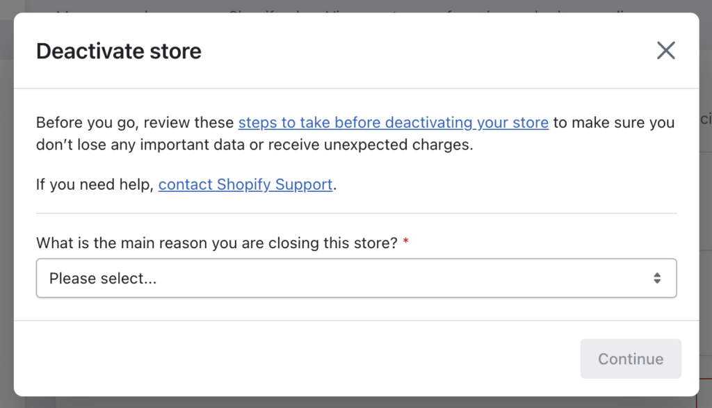
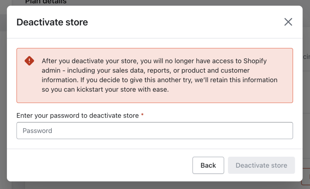
The existing cancel flow offered few options, and most of them weren’t good options for merchants or Shopify.

The question

How can we provide a set of options to a merchant opting to cancel that offers them a better-fitting solution?

The answer

With an updated and enhanced cancel flow that provides better options for the merchant and for Shopify.

The process

Merchant segmentation is complex – subscription plans vary, billing cycles vary, and other circumstances make this project several projects in one. Each user flow required slightly different solutions so a merchant would have the best options available to them without being overwhelming.

We mapped out the user flows and all of the variations that existed, including all of the tiny edge cases that make surprise appearances partway through a project.

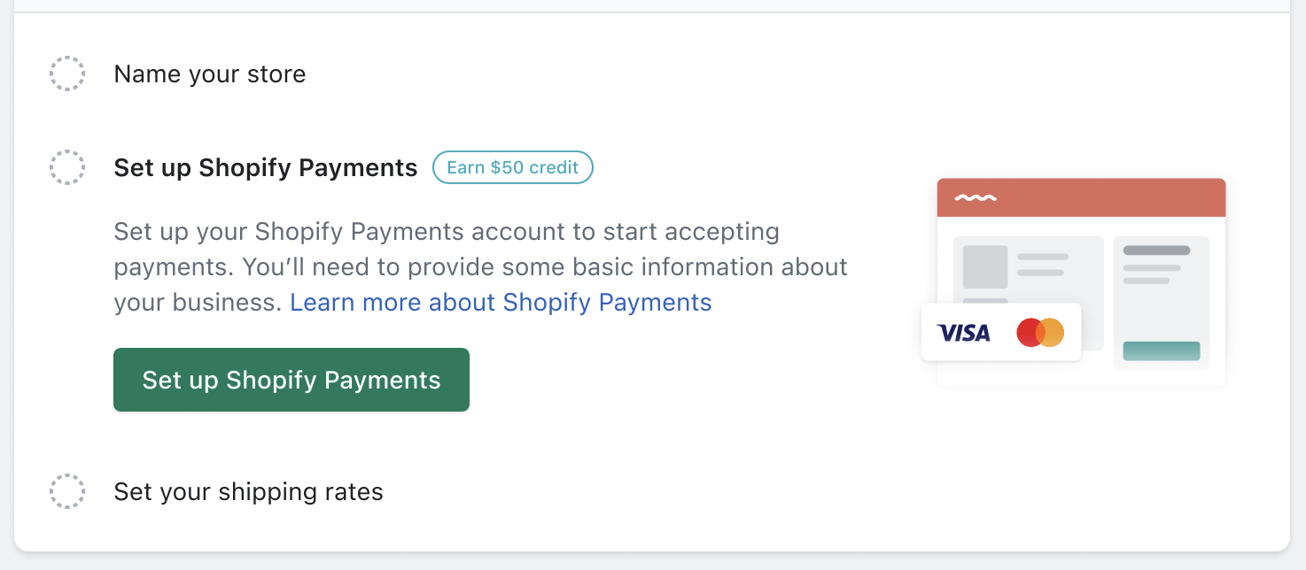
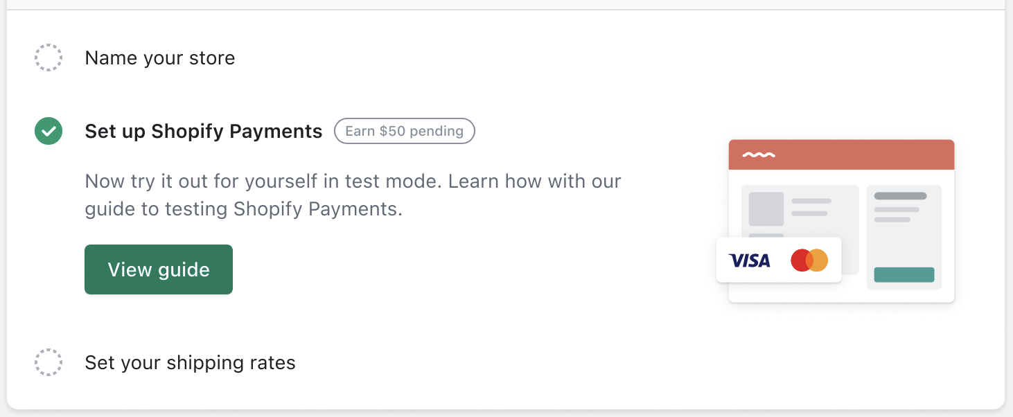
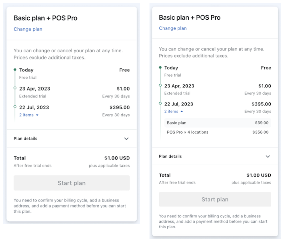
Our explorations included several iterations on the user interfaces within the merchant admin panel. Because we were presenting much more information than before, it needed to be concise to keep merchants from skipping over it.

The work

The work included:

  • User flows
  • Updated messaging in the user interface
Cancel flow for a merchant on the Basic monthly plan
Cancel flow for a merchant on a $1/month paid trial of the Basic plan
Cancel flow for a merchant on the Advanced monthly plan
Change modal for a switch to the Pause and Build plan
Last chance modal for special pricing

The results

This was a high-priority project, as keeping merchants, even at a lower-priced plan, is better than having the merchant cancel completely. It was slated for development when I left the company.

Shopify: Merchant productivity incentives

Merchants that complete their Shopify online store setup are more successful than those that do not. To encourage completing setup tasks, we created an incentives program that rewarded merchants for reaching key setup milestones.

My role: Content design lead, UX design partner.

The situation

Merchants sign up to get access to the Shopify platform and tools; from there, they can setup their online store and soon begin selling.

The complication

Many merchants that sign up never finish their store setup; others complete it partially, leaving out key tasks that might help them get their first sales. Those first few sales are strong indicators of long-term success, and therefore long-term commitment to a Shopify subscription plan.

The question

How can we help merchants complete their online store setup to ensure their success?

The answer

By providing them with task-based incentives that match their activity with useful and usable rewards.

This was a complicated endeavor, as it reached into the functionality of legacy systems, requires new user flows, and the analysis of past user behaviors.

The process

The project started with the team collaborating on a decision tree outlining all of the potential paths a merchant might take when setting up their store. We highlighted portions of the the journey where we could affect the most change, and determined which incentives might make the most sense.

Next, we iterated on where we might best put these incentives in front of merchants. The communications slate for new merchants is already stacked full, and the surfaces we could alter to tell them about the incentives were limited.

With that narrow scope, we set forth making small inroads where we could, often small-yet-smart additions in places where merchants already visit. This narrow scope gave each character and pixel even more weight than usual in an already-concise surface.

The work

Since we addressed a complete user flow from awareness through redemption, we designed for each touchpoint along the way.

The first appearance of the incentive
The incentive pending state
Incentive available for use state
Email notification of incentive redemption

The results

Even though the final output appears minor and subtle, it’s on track to have a considerable impact: an estimated gross profit of $12.7M over three years.

Numerous variations and different approaches led us to craft an experience that balances merchant attention, the constraints of the surfaces, and the priority that leadership placed on it.

Shopify: A better merchant checkout

The merchant checkout was unclear, and we wanted to make it better. Too much copy formatted in an awkward way led to a confusing user experience. I helped untangle it from a UX and content design angle.

My role: Content design lead, UX design partner.

The situation

When a merchant checks out as a part of making a change to their plan subscription, they are presented with a summary, clearly showing what amount they will be charged and when it will happen.

The complication

This is an important summary, as it validates and confirms what their costs will be in the future. One wrong click or two and they could be charged several thousand dollars, as opposed to $5. The checkout works the same, no matter the amount.

The old merchant checkout summary

The summary used to display all of the detail in a few lines of free text, quickly becoming complicated as more subscriptions get added. The lack of formatting made it as easy to read as a story problem in math class.

We also had different versions displaying in different places (i.e., mobile web, native, and desktop.)

The question

How can we make this critical part of the merchant experience more clear and easier-to-understand?

The answer

With a revamp that includes a timeline component to display the information in a simple, chronological fashion.

The process

Iteration was the name of the game for this project. We worked through dozens of variations in the content and user experience. None of the discarded versions were completed in vain – each moment we spent with the problem helped us think more clearly about it.

Like almost all projects at Shopify, the prototyping took place entirely in Figma. This common work area allowed us to collaborate in a live and equitable way, without anyone’s work languishing in a separate document.

The work

We took an untidy situation and made something that was scalable for future product and subscription additions.

Collapsed on left, open on right

The result

The merchant checkout improvements are live in the system today, bringing greater clarity and confidence for each merchant transaction.

Book publishing: A very special volume

In 2021, I edited and published an on-demand-printed book of my grandmother’s poems and paintings titled, “The Beauty That’s Surrounding Me.” It’s sold dozens of copies via a bespoke Shopify store.

My role: Content design lead, publisher, visual designer, UX designer, e-commerce guru.

The situation

My late grandmother was a poet and painter throughout her life, leaving behind a rich archive of writings and works.

The complication

Most of these writings were gathered in a single three-ring binder at my parents’ home. No one else that knew and loved her could easily see her wonderful creative output.

The question

How can I get a bound volume of these works on my own shelf, and how can I get it in the hands of friends and relatives?

The answer

By self-publishing it on Lulu.com and selling it through a connected Shopify online store.

The process

This was a labor of love. I started work on the anthology during the pandemic, when she was still with us. She passed before I could put a bound copy of her life’s creative work in her hands.

The first step was to collect and transcribe all of the poems, and to rely on family members to capture images of the paintings. I wrote a foreword and a brief family history to set the context of the works.

Once gathered, I formatted them carefully into a paperback template for upload to the print-on-demand service.

While working at Shopify, I set up a store that detailed grandma’s story and offered the book for sale. I connected it to the print-on-demand provider. Soon, relatives and friends were ordering the book and welcoming it into their homes.

The results

It’s all available for view at krullbook.com.

Grandma would’ve been proud.