Categories
Uncategorized

Cash App: A new product and vision for businesses

Small business owners want to tap into the power and reach of the Cash App network. So we set out to make Cash App a truly useful and robust tool for their business payments.

My roles: Content design lead, product design partner, UX research partner.

The situation

Many Cash App users are also small business owners. Historically, some of those business owners take business payments via their personal accounts and use all of the features. They like Cash App because of the powerful network effects.

The complication

Though Cash App does a great job of supporting peer-to-peer (P2P) payments, the app falls short for small business owners. Most features in a personal Cash App account are no longer available on business accounts—features that many business owners have grown to rely on.

Business owners may find themselves forced into a business account due to business detection protocols, and account switching between business and personal accounts is not yet an option.

A rudimentary business account version exists, but its benefits are limited to compliance and a tax statement. Even the sister commerce company, Square, has a stronger set of incentives.

The question

How can we attract small business owners and support their operations?

The answer

By developing a robust product and experience that actually meets the needs of small business owners while keeping it cool (and brand aligned).

The process

The company hired new design staff to take this on: two product designers, a design manager, and a content designer (me!)

We started working with existing staff, including product leads and UX researchers come up with a vision for what we called Cash for Business.

  • Conducted a competitive analysis to record features, positioning, and messaging
  • Conducted two rounds of user research that included study design, survey writing, and post-survey analysis
  • Engaged in deep platform visioning: high-level strategy work, product feature exploration, and positioning
  • Crafted detailed user personas and business use cases
  • Sketched out feature sets to close gaps in the existing product to meet user needs and expectations
  • Prioritized and started developing the P0 feature: Tap to Pay

The work

The work unfolded in stages, with some of the workstreams happening simultaneously.

The results

Leadership loved it.

One leader said, “This is the best work I’ve ever seen at Cash App,”

Another commented, “There’s so much great stuff here that this should be a startup within the company.”

The retro

What didn’t go well on the project?
Legacy issues restrained our potential. Past versions of the app were built on an architecture that limited how far we could take some of the new product features.

We weren’t able to get prioritization to execute on it. Due to a re-org, the team itself was dissolved, and the work was not completed.

What went well on the project?
We went beyond products and built a vision. Instead of focusing on the products alone, we dug deep on the user context, getting to the core of their needs.

Strong collaboration across the board. In-person meetings at a critical point in the project helped us leap ahead based on our earlier work.

Leadership loved it. I shared this earlier, but they loved loved it.

Categories
Uncategorized

Cash App: Compliance and content design

The payments space is constantly evolving, and the user experience must evolve along with it. We needed to bring a key part of the business into compliance, and do it elegantly.
My roles: Content design lead, product design consultant.

The situation

Peer-to-peer payments started with the idea of transferring money easily from one person to another with a minimum of friction. Make it simple, and the public will naturally gravitate to your product—especially those that may have been left out of the existing financial and banking systems. A low bar for entry can open access for many.

The complication

As the product gained wider adoption, regulators took note and began to apply the rules that other banks and financial products follow. The rules include verification of individual and  business identities to ensure that everything is safe, secure, and in line with laws and regulations.

Building out a system that works with the existing product, numerous client states, and legal/compliance needs is a massive undertaking. We risk customers leaving if the process seems too complicated, but it needs to be thorough enough to pass the legal litmus test.

The question

How can we meet new regulatory needs and keep as many users as possible?

The answer

By designing a flow that elegantly balances user expectations, regulatory realities, and compliance requirements.

The process

We couldn’t jump in and start designing without understanding some key things:

  • What the regulations require, and how they apply to our users
  • What can the platform execute
  • What help documentation we need to support the change
  • How we are positioning these changes
  • How users fare in similar flows (behaviors, data, etc.)

This was a project without a clear start date; it was a situation where this type of work had been happening for some time, but now was entering into a more intense, urgent phase ahead of external deadlines.

Sometimes, a project has a tidy kickoff. Other times, players join mid-stream and make sense of things as they do the work. That’s what we did here. New product manager, new product designer, and a new content designer (me!).

The work

Figma was our home. Components made up that home’s furnishings. We lived in it, welcoming guests from across the neighborhood in the form of business partners throughout the company.

Any minor change to wording within the experience could jeopardize the success of an entire product type, so we needed to remain empathetic and vigilant to the company needs as we brought the situation into compliance.

Most of the work happened in partnership with a dedicated product designer. Together, we workshopped the flows screen-by-screen for the three user types and the varying user states.

From there, I took the experience and flows we’d crafted together and focused deeply on the content itself. And it took focus: business logic, engineering capabilities, and legal/compliance constraints, all handled within the tiny confines of the app’s regular screens, dialogue boxes, and push notifications.

Our business requirements shifted a few times while we were working on it, requiring changes in the experience—sometimes just a language tweak, and other times a reimagining of large portions of the flows.

Content design at this level of business complexity is a little like juggling—three balls in the air is workable after some practice. With 39 separate user states with many of which were dependent on one another, we were juggling all of the balls.

The results

When this work made it in front of design reviews and experience reviews, we were applauded for our deft handling and distillation. In the end, I created:

  • New screen and component designs
  • New user flows and pathways
  • All content, including UI copy, push notifications, and emails
  • Writing and messaging guidelines

What started as an unfathomably complex series of scenarios ended as a concise experience that met all of the requirements on time. We broke new ground, created new components and writing guidelines, and ushered in a new era for the company.

To get an idea of the scale of the project (and for fun), here’s a zoomed-out view of one of the user types in the Figma file:

It was one for the ages, this project!

State Farm: CSR and content strategy

As a part of their corporate responsibility activities, State Farm launched their Neighborhood of Good program to demonstrate how their agents and employees contribute charitably to the neighborhoods where they live. I designed an editorial system and strategy to foster employee involvement and evangelism.

My role: Content strategist, content design lead.

The situation

State Farm has thousands of employees, and each one is asked to do good work in their own neighborhoods.

The complication

The definition and threshold for good work wasn’t clear for many employees. What qualifies? How do I share the good work that I’ve done? What would inspire me to act?

With channels as diverse as intranets, lobby video reels, and messaging via senior leadership, the situation was quite different than a standard website launch.

The question

How can we raise awareness and increase participation in the program with the limited channels available?

The answer

By developing a comprehensive communications framework, a content strategy and an easy-to-use toolkit for State Farm staff to support the ongoing effort.

The process

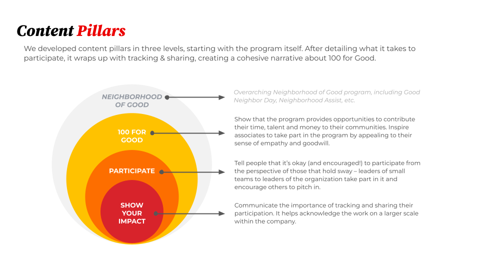
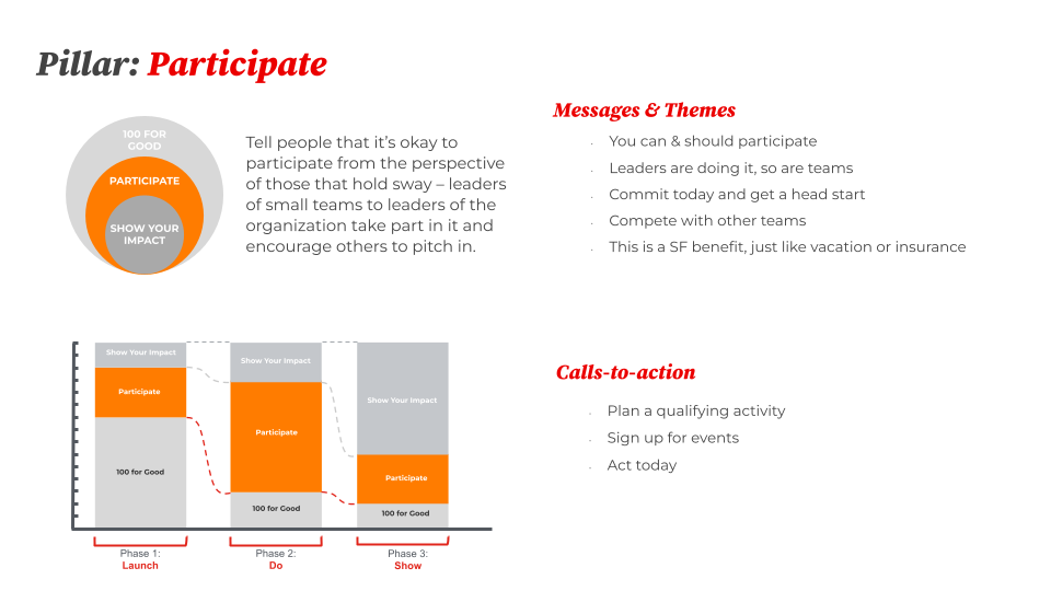
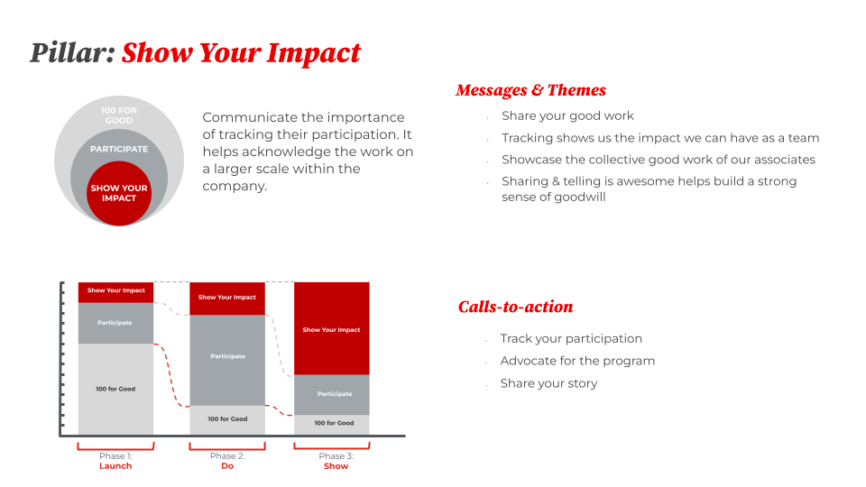
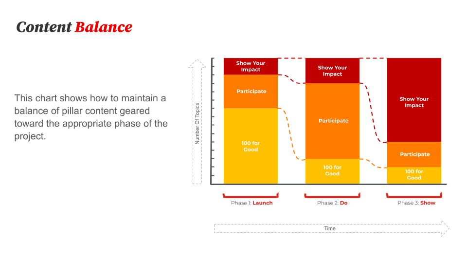
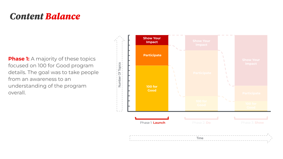
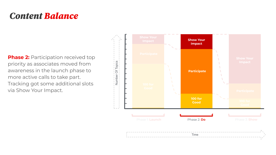
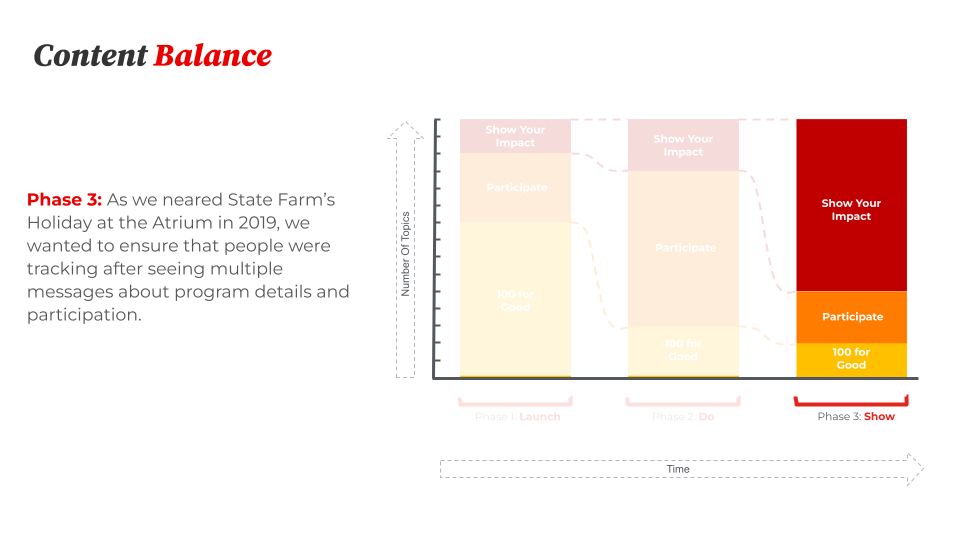
State Farm needed a content strategy to support the internal companion to the program, 100 for Good, to raise awareness of it, and increase participation in the program.

  • The 100 for Good work operated separately from (but in harmony with) the larger Neighborhood of Good program
  • Our remit was to create a set of rigorous editorial tools for client use
  • No publicly-accessible assets — all materials would be seen in State Farm physical locations, on intranets, behind logins, and in internal emails
  • Limited tracking opportunities to measure success
  • Tight timeline due to larger project release dates

The work

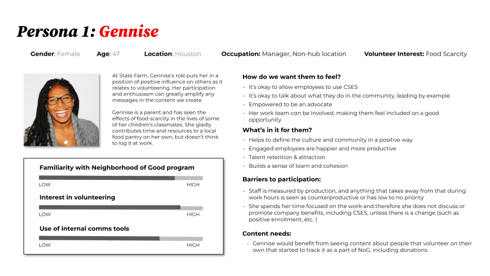
We conducted an in-person workshop with subject matter experts to inform persona development:

Created a set of tools that we handed off to content creators, program managers, and leadership to use on day one

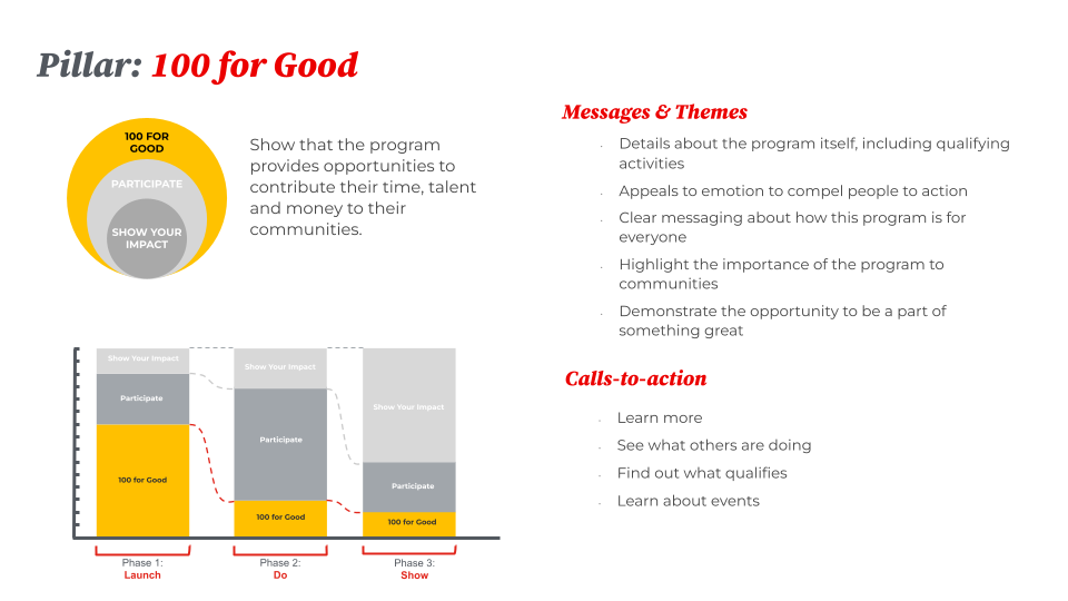
Established a content strategy that gives a nod to the quirks of non-web, (and sometimes arcane) digital channels

Developed editorial guidelines to help content creators focus on what they do best

Provided careful instruction on how to use and adapt the tools as needed.

The results

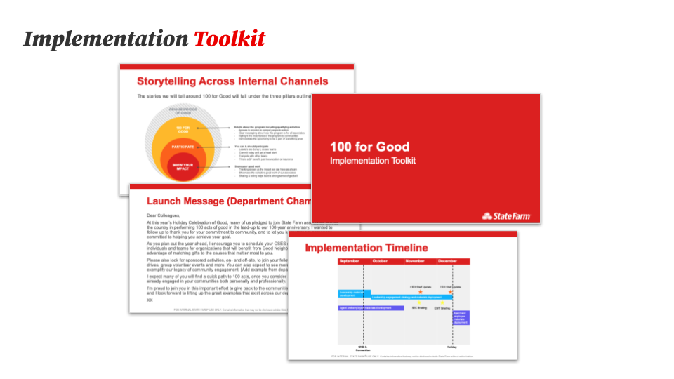
We handed off a series of tools to State Farm:

An Implementation Toolkit driven by the content strategy work

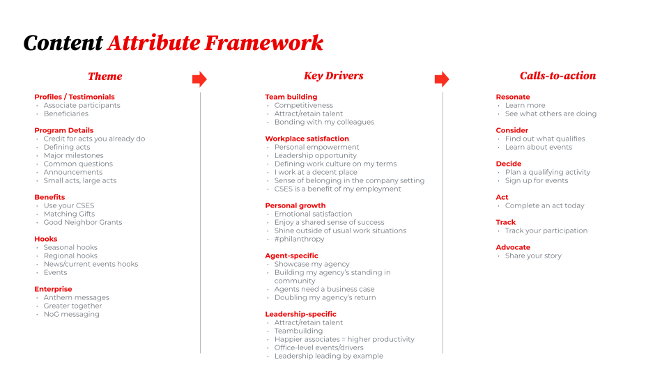
A Content Attribute Framework to help them create content for each of their internal channels

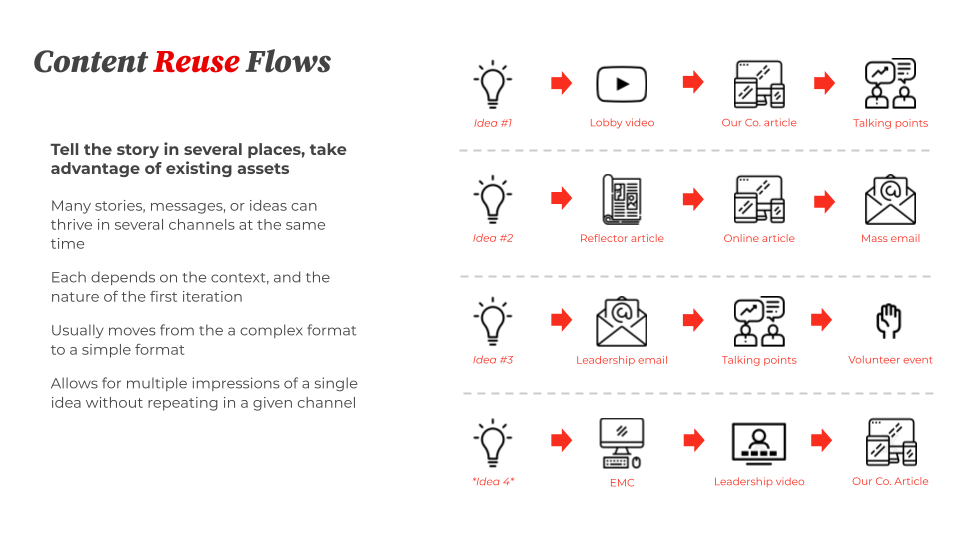
Simple Content Reuse Flows to guide what gets published where in their ecosystem

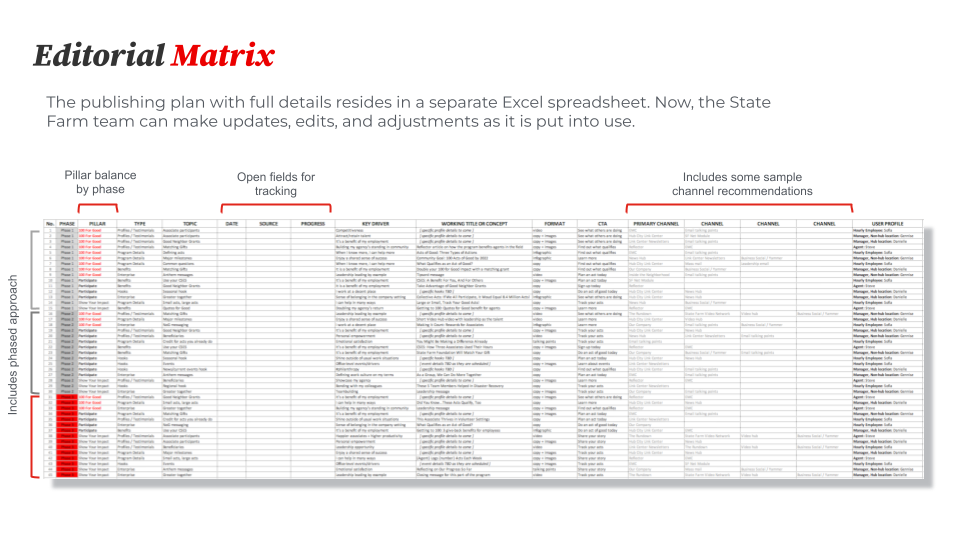
An Editorial Matrix featuring an asset-by-asset plan to support content creation and publishing

GSK/Voltaren Gel: launching a product and website

GSK was slated to receive FDA approval for transitioning their prescription arthritis pain relief product to OTC. The brand needed a multi-phased website plan to accommodate the different stages when entering the market with a new OTC drug.

My role: Content strategy lead, UX research partner, UX design partner, UX writer.

The situation

GSK’s prescription topical arthritis pain reliever, Voltaren, was set to move to over-the-counter (OTC) availability.

It was a big moment, as Voltaren would then be the only topical NSAID drug on the market. That’s a rare occasion, and GSK wanted to make a splash.

The complication

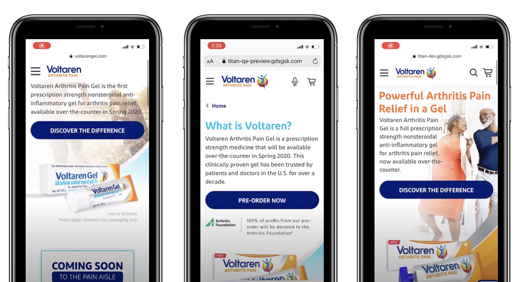
This was no ordinary website, however. It was three websites, one for each phase of the product launch:

  1. Pre-launch phase, to share the benefits of the prescription version
  2. Pre-order phase: a limited site to inform people about its upcoming OTC status and to facilitate product pre-orders
  3. Full site, with e-commerce integration and all site features/content

Each phase had different content needs, different reach, and different audiences.

A partnership with the Arthritis Foundation added some additional needs to the project, as the client wanted this to become the first arthritis-friendly website experience.

And the FDA timeline shifted several times!

The question

How can we create three sites, hit FDA timelines, and make this site arthritis-friendly?

The answer

With a carefully crafted strategy, centered on content and the user experience, spanning all of their digital surfaces.

Pre-launch, pre-order, and full-site versions

Our website scope included data analysis, persona & journey development, content strategy, UX design, visual design, content development, and testing.

The eCRM scope included content strategy, email user flows, email content development, and ongoing program management.

Dependencies included the FDA, the Arthritis Foundation, and Paula Abdul (the spokesperson).

The process

We provided a total support system for arthritis sufferers:

  • Developed search-optimized educational content that promoted and supported overall health and wellness for arthritis patients
  • Included accessibility modifications for arthritis patients: large tap targets, text resizing, and the ability to view hands-free content via videos
  • Created the first GSK site with voice search capabilities and voice chat
  • Tested prototypes in partnership with the Arthritis Foundation to validate an optimal user experience relevant to arthritis sufferers
  • Paired it with a first-party data collection, an eCRM strategy, and a targeted email program

Some samples from the client-facing presentation:

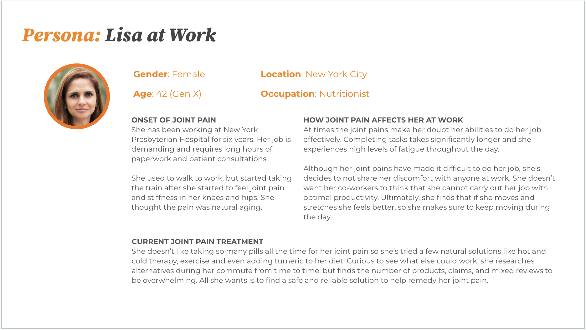
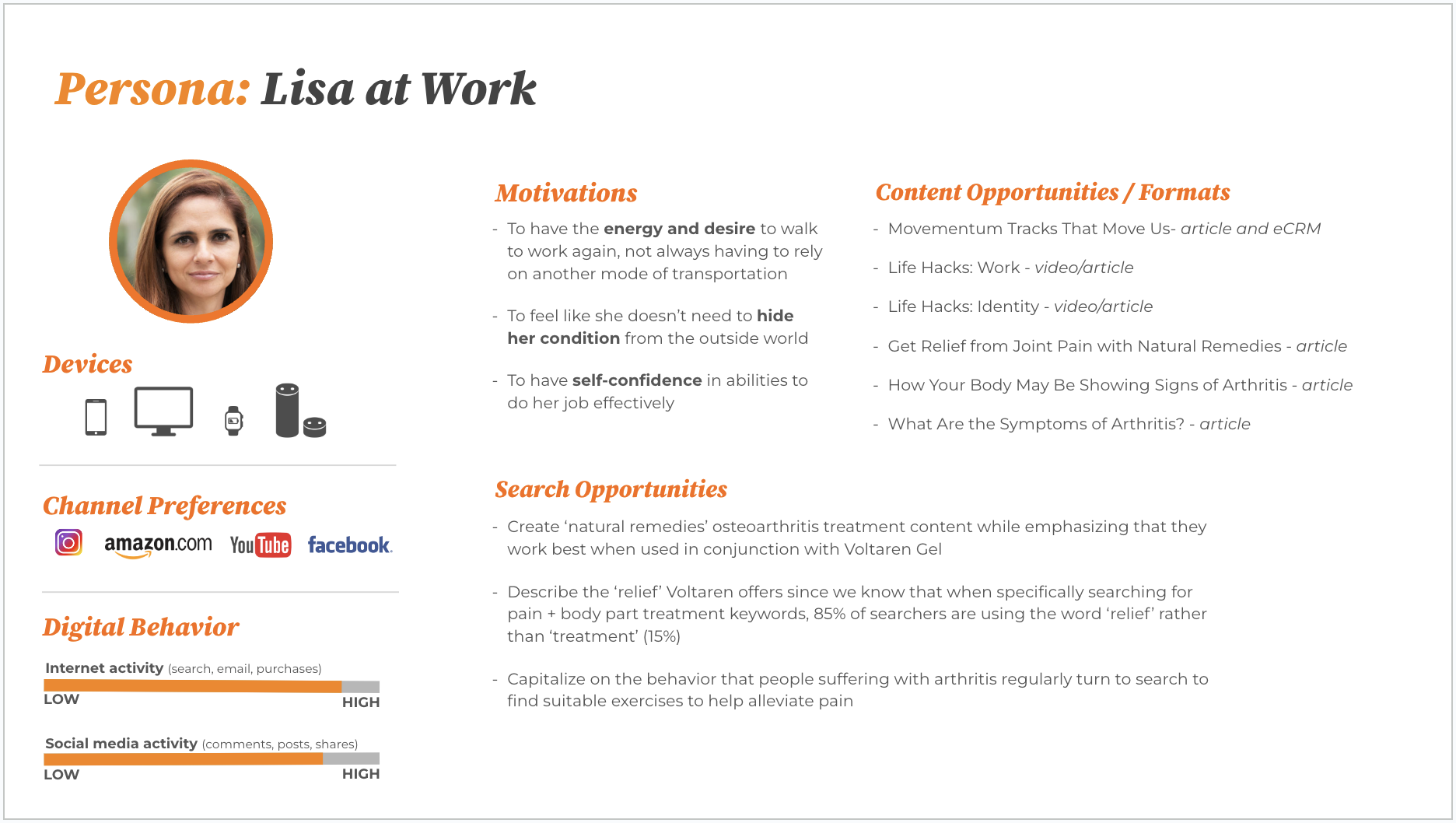
Persona story
Persona details
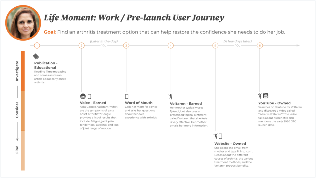
Persona user journey for the pre-launch experience
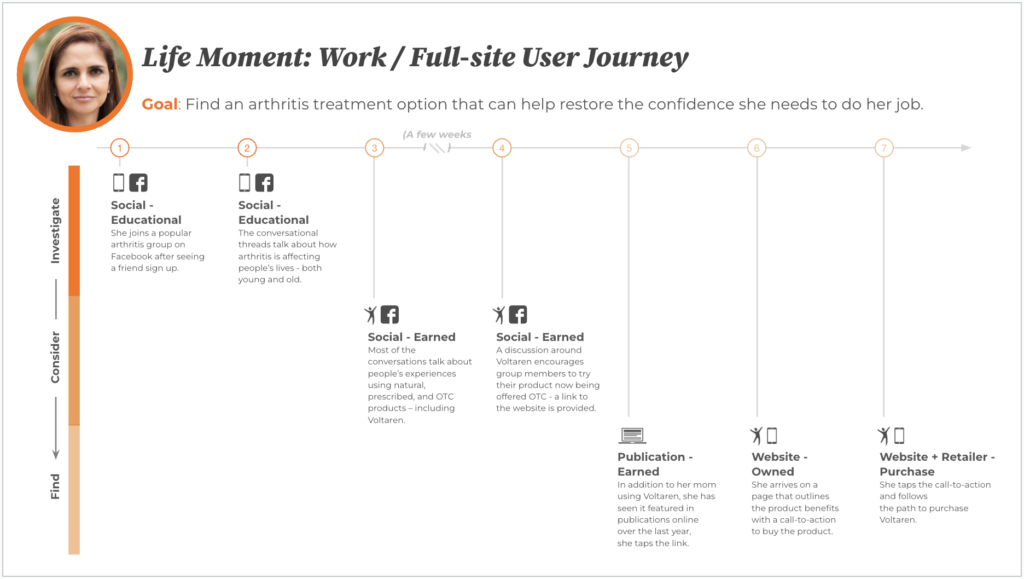
Persona user journey for the full-site experience
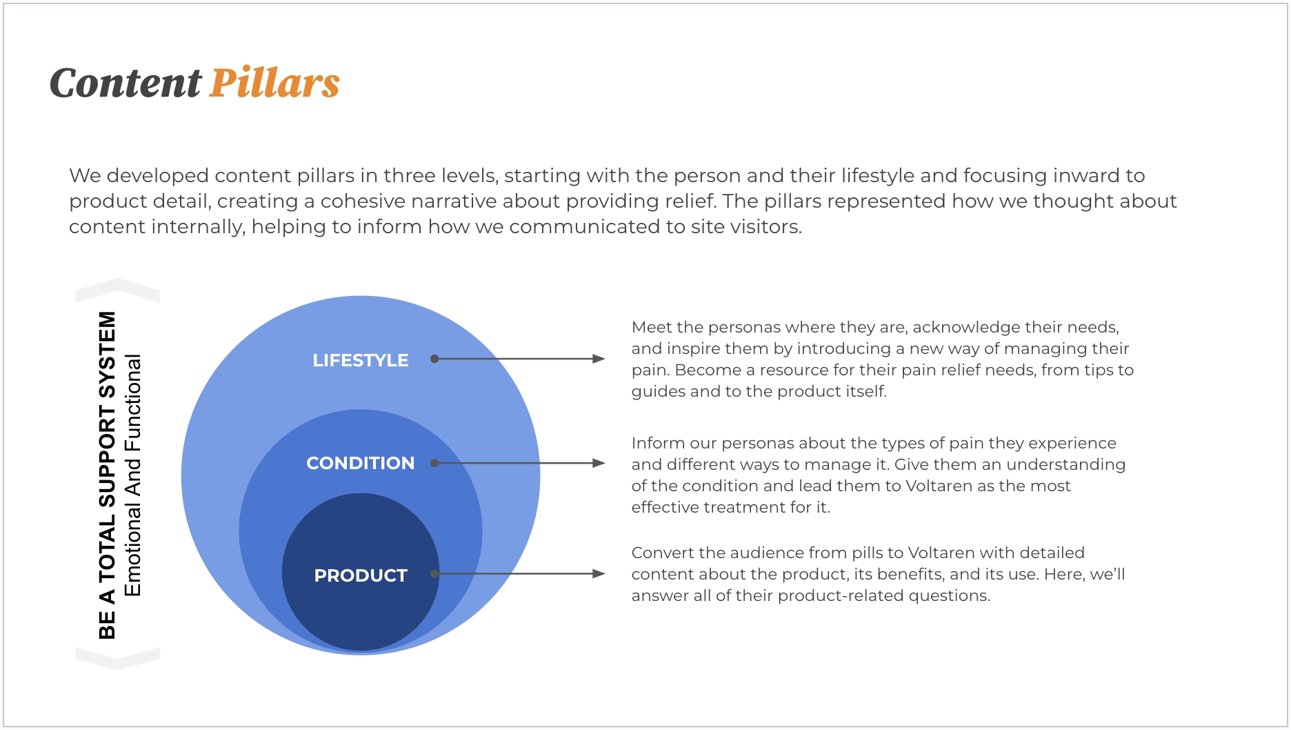
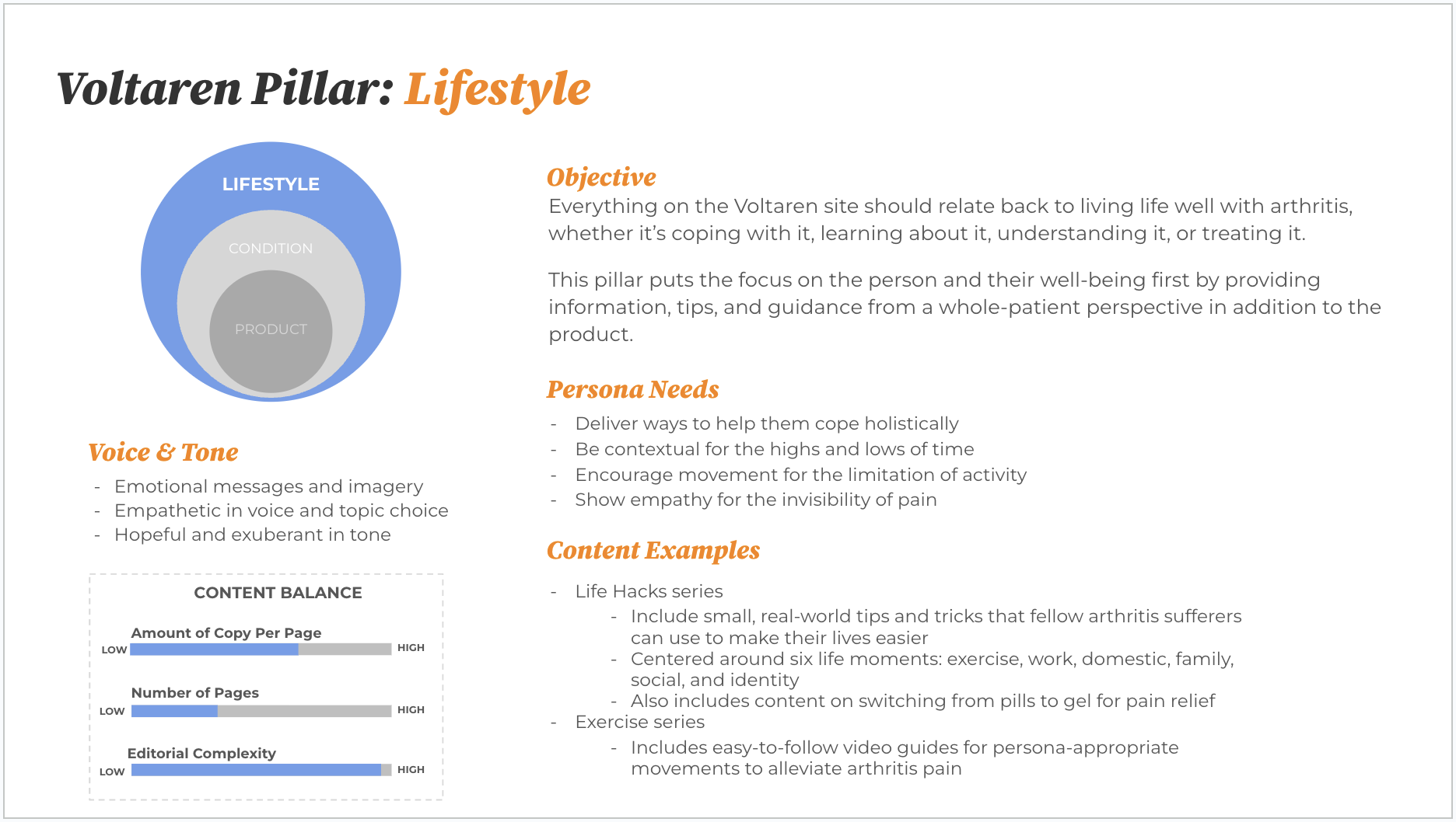
Content pillar summary from the content strategy
One of the content pillar detail sheets

The results

Consumer-centric innovation and content
We conducted prototype testing with arthritis patients which showed that 99% of users found the website easy to use. The feedback was overwhelmingly positive, especially for our accessibility modifications.

During the first month, over one third of queries within on-site search were via voice input vs. typing.

During the first month of launch we had over 35,000 users opt-in to our eCRM program. This is a conversion rate of 17%, which was 4x our estimated target.

Product education and clear paths to purchase
Pre-order week 1 was noted by Shoppable as the highest one-week total sales of any brand partner.

Pre-order drove strong awareness and conversion into the brand with Voltaren achieving #1 in the External Analgesics Category within 3 weeks and #4 in the Total Pain Category within 4 weeks.

GSK/Benefiber: Award-winning content design

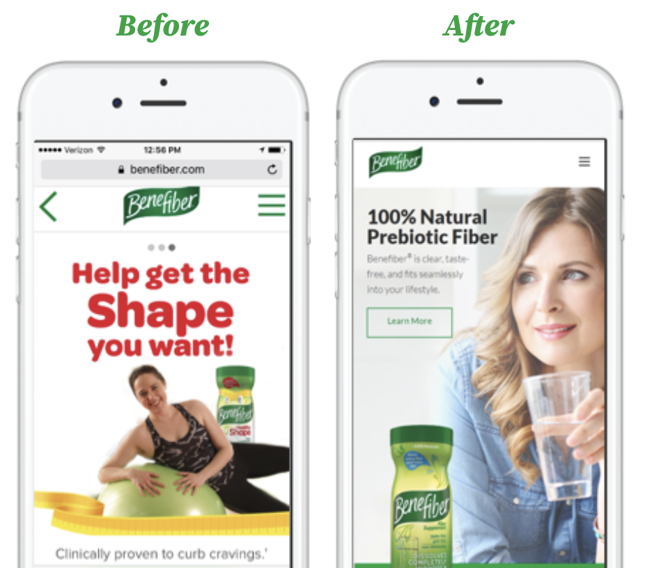
Pharmaceutical company GSK had a brand that needed a serious update. New products weren’t represented on the site, and the entire digital footprint was not working as intended. My content strategy work on this helped the team win a Shorty Award in 2017.

My role: Content design lead, UX design partner, UX writer.

The situation

Benefiber is a dietary fiber supplement for digestive health. New versions of the product had just become available.

The complication

The old brand site was in shambles, with expiring third-party content, outdated messaging, and branding that was no longer relevant.

The brand had a new product and a new benefit, and needed to carve out a space for weight management in digestive health. 

The question

How can we make this site a more holistic health resource?

The answer

With a comprehensive content strategy that shifts it from a problem/solution use-case into an everyday wellness routine that helps support good health (not just digestive health). 

The process

Unlike other GSK products, Benefiber required more education to demonstrate how it works and why it’s important. As is often the case in the pharma/supplements vertical, we faced limitations with language due to supplement status.

New products on the shelves and others on the horizon required designs and strategy to accommodate them.

We used audience and search insights, creative pre-testing, and an integrated custom Google Analytics 360 implementation to elevate the new Benefiber.com.

Our mobile-first design accommodated use-cases for persona-appropriate in-store and on-couch settings while still supporting desktop usage.

Finally, we enable heightened product sales through strategic onsite content-to-commerce.

The work

We created a comprehensive content strategy the guided the visual design, user experience design, and content design. Some highlights:

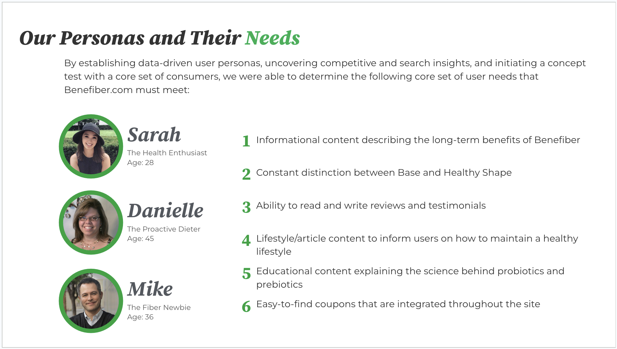
Persona needs documentation
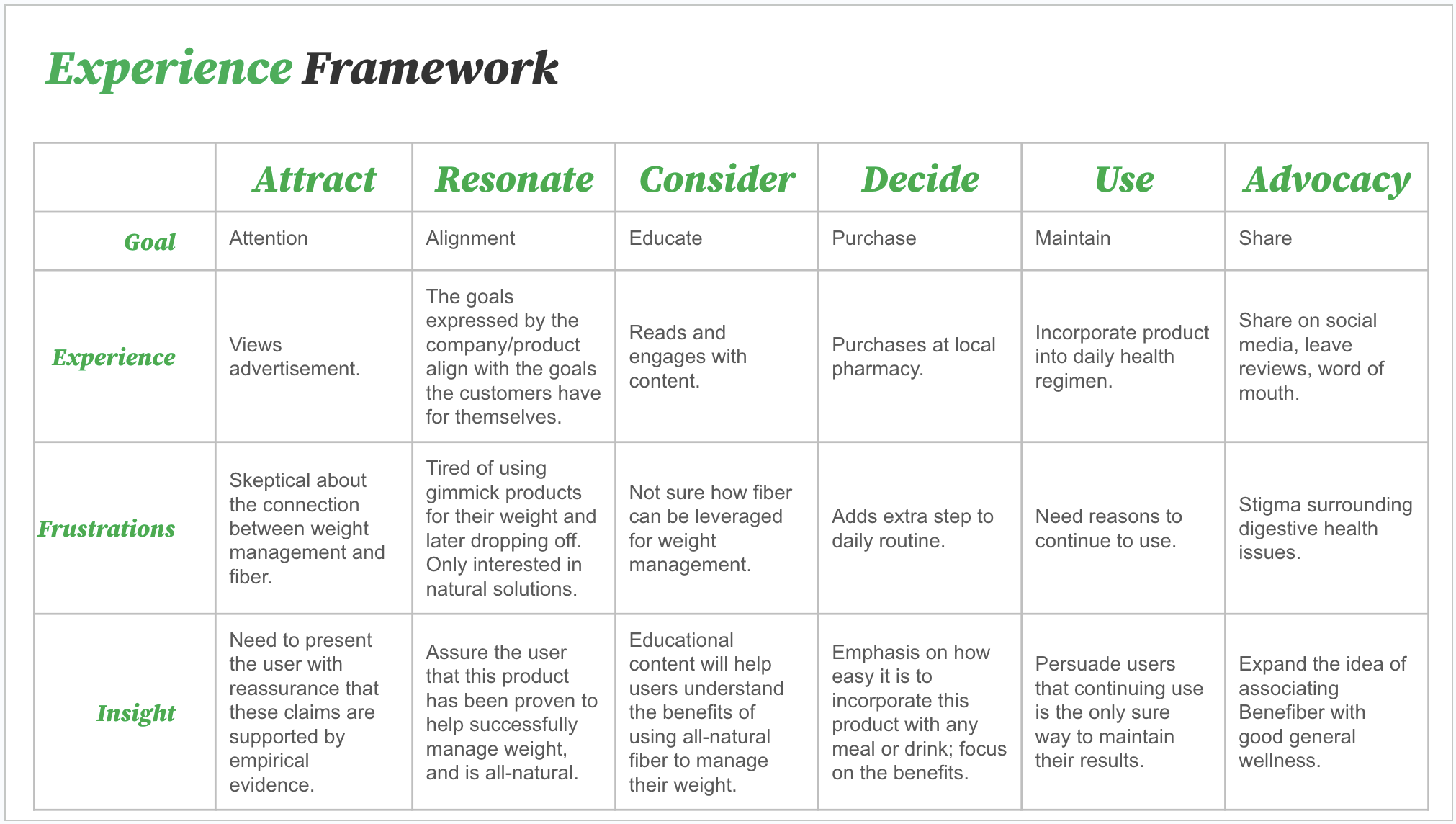
User experience framework
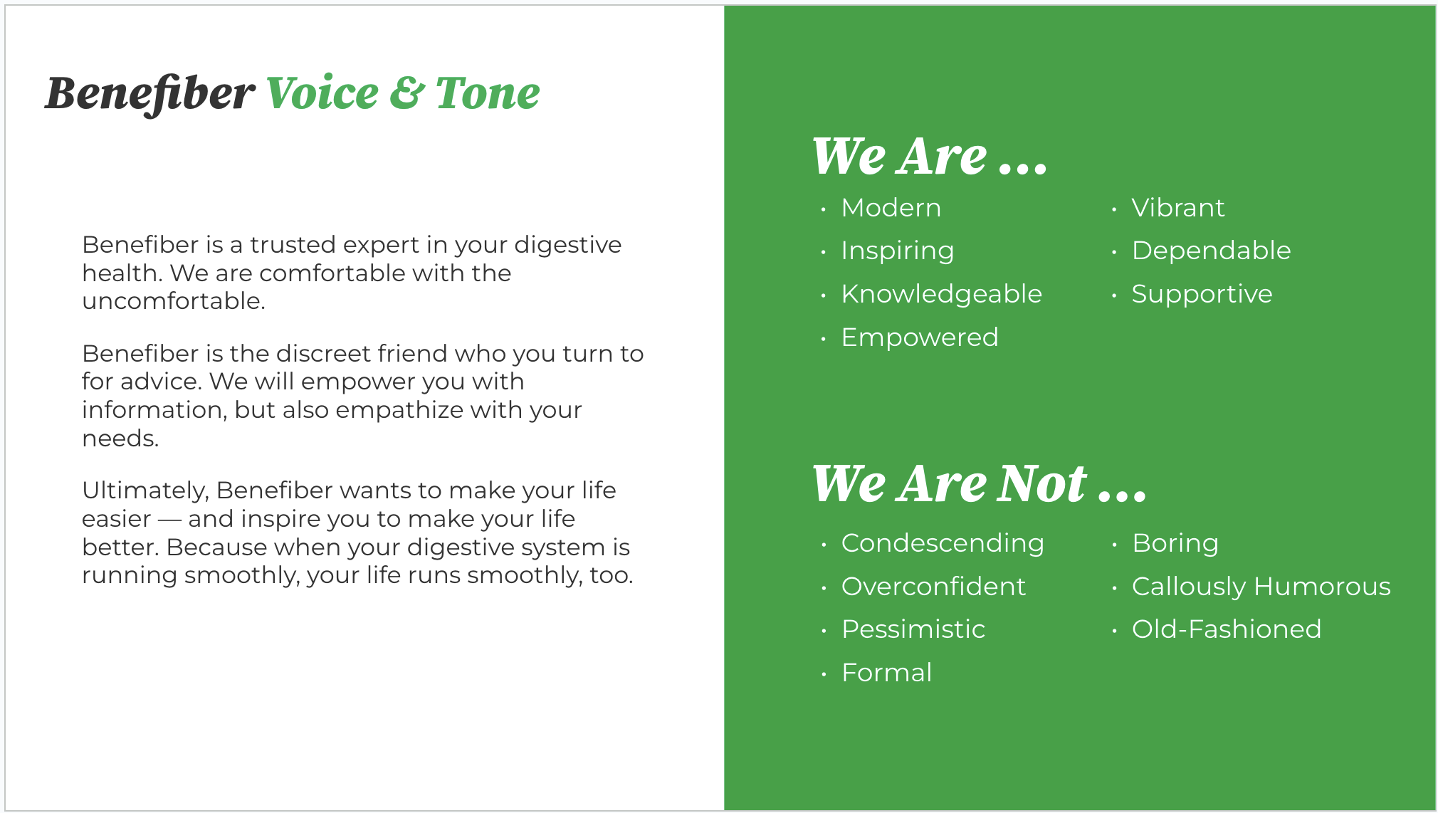
Voice and tone guidelines
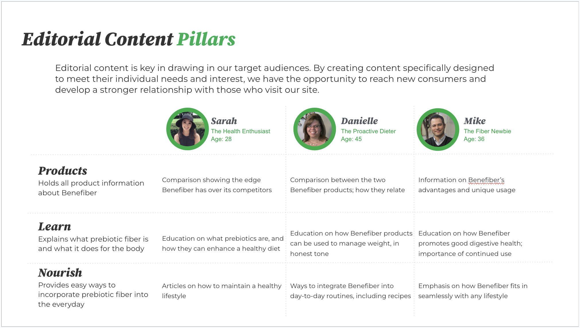
Content strategy pillars
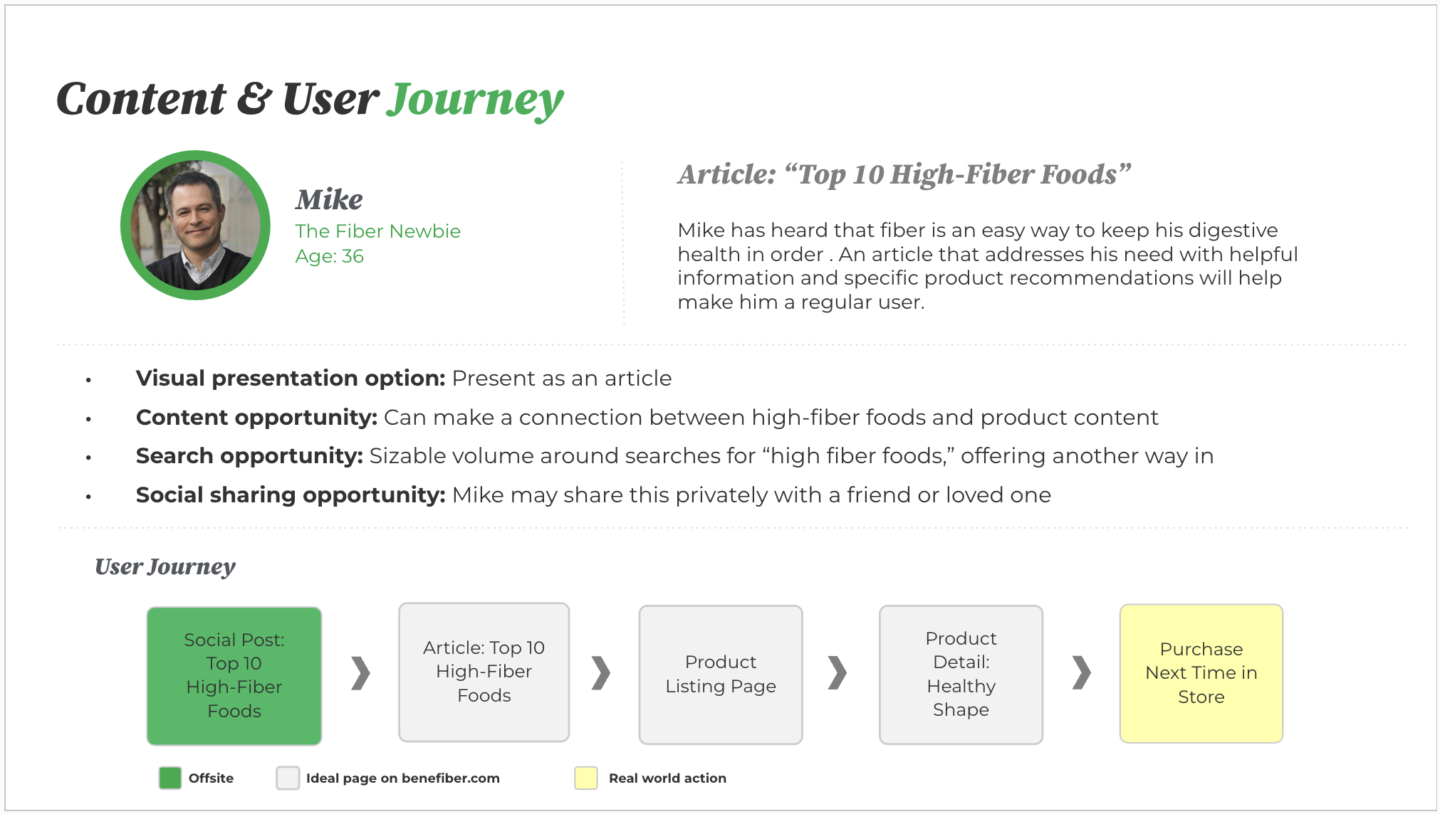
Sample user persona

The results

The work won the 2017 Shorty Award in the Health, Fitness, and Medical category.

Other results:

  • +20% more coupon conversions
  • +56% more average time on site per session
  • 91% consumer satisfaction rate (up from 76%)
  • +100% more sales from website-referral traffic to retail sites
  • +300% more multi-page engagements, reducing bounce rate
  • +500% more organic traffic to all product pages

Speaking engagements

Wherever I go, friendly folks always comment on my voice. “You should be on the radio,” they’ll say.

“I was, for many years!” I’ll say, usually to their surprise.

Over the years, I’ve taken my radio voice on tour, speaking about user experience and content design to students and professionals. It’s a great opportunity to share what I’ve learned and to field questions from people at all experience levels.

Most recently, I was a guest on The Content Strategy Podcast with host Kristina Halvorson:

Other past engagements:

  • MIMA Coffee & Case Studies, 2018. Co-presented the award-winning GSK Benefiber web transformation
  • Fargo-Moorhead Content Strategy Meetup 2016. Presented my own approach to content design.
  • MSP Content Strategy Meetup 2016. Presented my own approach to content design.
  • University of Minnesota, 2016. Guest lecturer for a senior-level marketing course.
  • College Broadcasters, Inc. Conference, 2015. Keynote presentation to the national conference gathering of college broadcast professionals.
  • MSP Content Strategy Meetup 2014. Featured presenter.
  • MSP Content Strategy Meetup 2011. Featured presenter.
  • MIMA Summit, 2008. Co-presented a session about bringing an old-media company into the social and digital realm.
  • Integrated Media Association Conference, 2007. Led a panel at a national public broadcasting technology conference.

Volunteering: A classical content design overture

In 2020, members of the 10th Wave Chamber Collective, a group of classical music performers, approached me for some help with their digital presence. I was happy to volunteer my services in the form of a content audit, content strategy, and user profiles.

My role: Content design lead, social media strategist.

The situation

This local classical music chamber ensemble has a digital presence across several platforms and services. They use this presence to let people know about upcoming performances in the area.

The complication

Their profiles and sites weren’t set up to deliver the engagement they needed to increase awareness about the ensemble and boost concert turnout.

The question

How can to help them get to the next level, digitally?

The answer

With a solid foundation based on the principles of content strategy. They needed clarity on how they compare to other groups in the area, and how they present themselves in the marketplace.

The process

I met with the group online to get a sense of what they were seeking, and how I might pair those needs with my skills.

I started with some audits to see how they compared to other local, independent classical music ensembles. Then I dug into their own digital presence, with an emphasis on their owned site and social platforms.

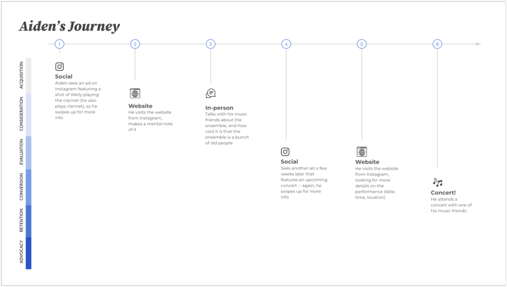
Once we reconvened to validate the first round of findings, I started the user profile and user journey development, as well as the content strategy and content pillars.

The results

Some sample slides from the presentations:

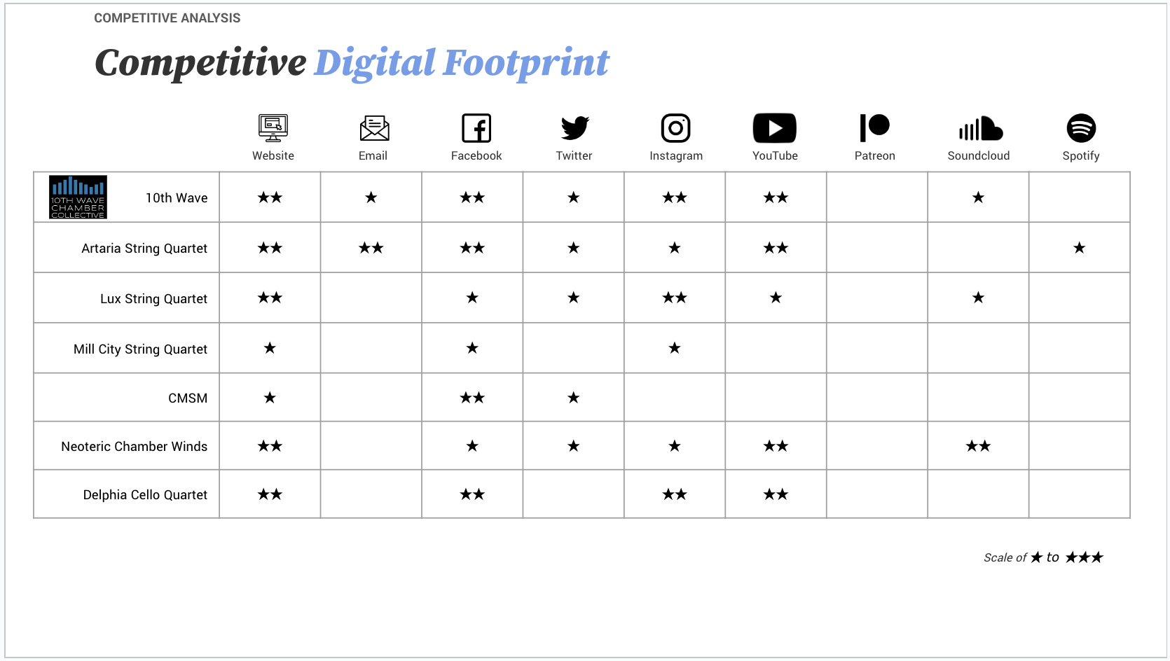
Competitive analysis across websites and social channels
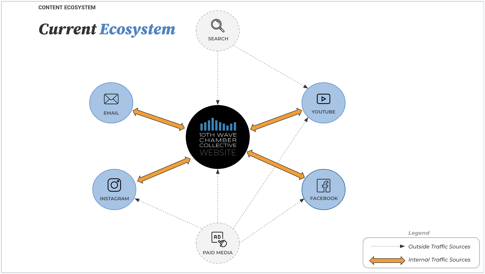
Map to illustrate their current content ecosystem
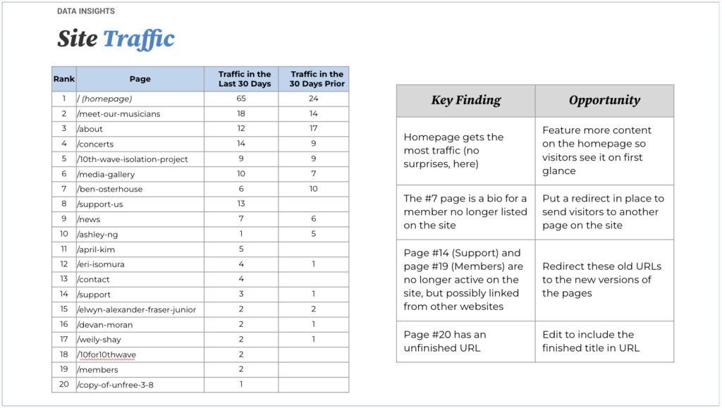
Site traffic analysis and recommendations
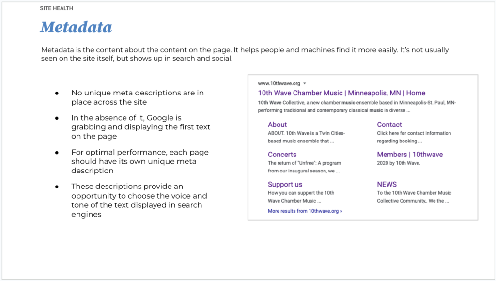
Findings from the metadata analysis
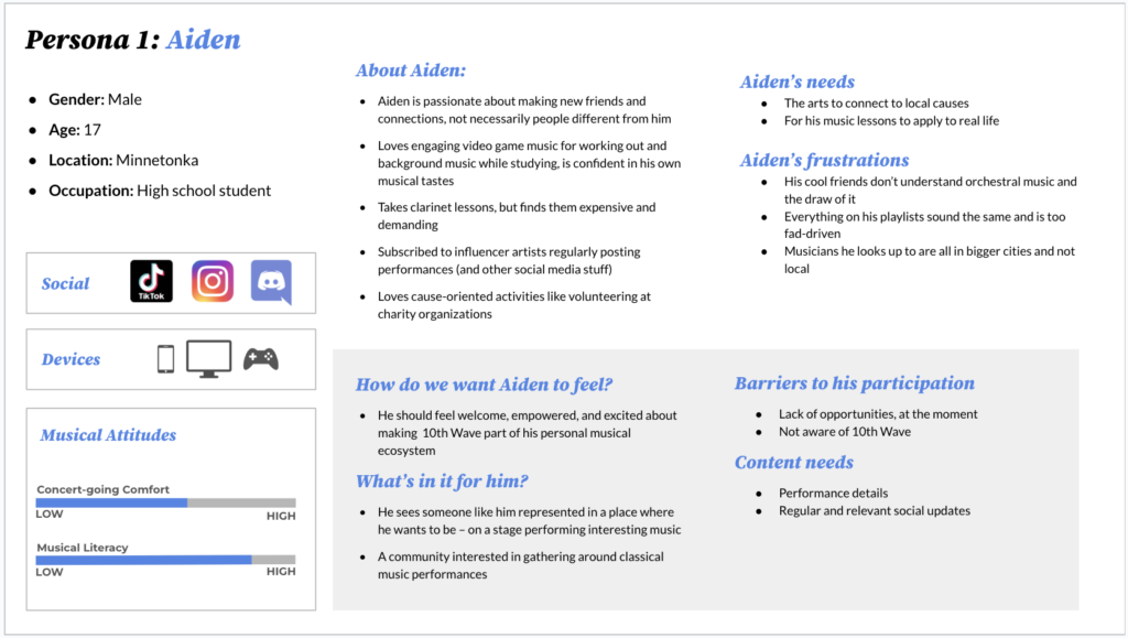
One of the four user profiles
One of the four user journeys

Shopify: Website and navigation redesign

The Shopify homepage and supporting pages remained largely unchanged for many years. A fresh design and new content created a significantly better experience for leads and merchants.

My role: Content design lead, UX design partner, UX writer.

The situation

The homepage reflected a Shopify of several years ago. The secondary-level pages did the same, and the navigation teetered on irrelevance from too many tacked-on items over time.

The complication

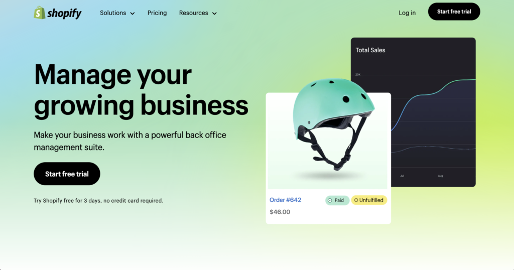
Since the last site launch, the company’s audience changed, the positioning changed, and the marketplace itself changed. Stakeholders insisted on including their products in the nav. And some things were flat-out inaccurate. The old homepage looked like this dull and lifeless, lacking the vibrant tone we now wanted to share with the world:

The question

How can we update the site to better reflect the current product lineup, voice and tone, and overall brand experience?

The answer

With a combination of information architecture, user experience design, UX research, and content design mastery. (And lots of collaboration across disciplines.)

The process

My experience in this project was unique, as I returned to it in various phases when it required my consultation and expertise.

Phase one: This was the first thing I worked on at Shopify, starting in December 2020. The visual design, UX, and content design teams worked in close collaboration, exploring different concepts, different voice and tone variations, and different content hierarchies. The project was put on pause, and I started working on other projects.

Phase two: The project resumes, and I’m brought in to collaborate on the information architecture of the navigation in the summer of 2021. We explored variations of the hierarchy itself and refined the language used in the confined space of a mega menu nav.

Phase three: Final content design work was a flurry of activity on an extremely tight timeline. The page hierarchies were in place, but the final content crafting was still incomplete. I was brought in to help manage the final content design and approvals with leadership.

Over the course of one week, another content designer and I collaborated in an intense and truly rewarding sprint to craft the content from a nearly-blank slate.

The work

Navigation: We crafted a clear and concise mega menu nav, with clear pillars that reflect the merchant experience with the platform, updated to add new items and trim unneeded ones. Every character is put to good use.

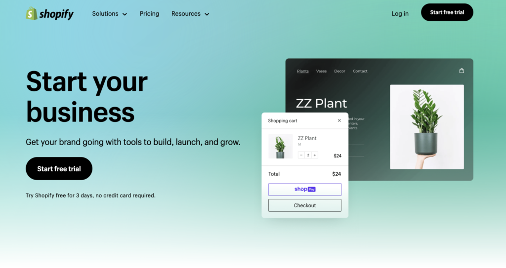
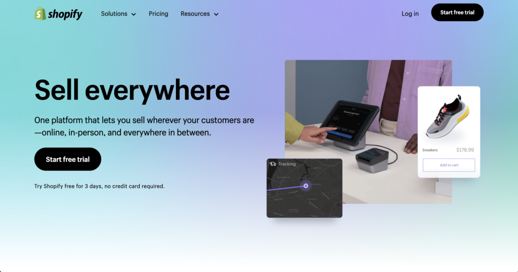
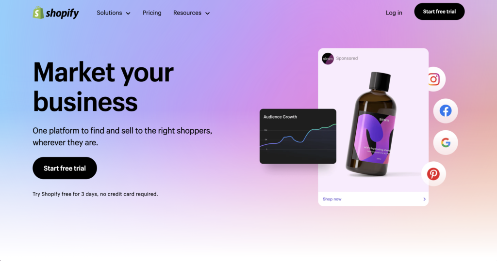
Homepage: The new merchant-first positioning is on fully display. Active language communicates just enough information to help leads make the decision to take the next step and sign up for a free trial.

The four pillars: Each pillar page details key aspects of the Shopify platform. The content design work resulted in a finely-balanced presentation of features and benefits, concisely written with the busy merchant in mind.

The result

The work is live, today! This is an accomplishment in itself, as even a minor dip in performance can trigger a rollback to a safer, earlier version of the site. It continues to outperform and out-convert the old versions. (It looks great and reads very nicely, too.)

Shopify: Leading a content design-first project

The shopify.com/free-trial landing page is the most-visited page on the whole website. But it was stuck in a design from 2016. We moved it into the modern era and created a better user experience by leading the project from a content design-first perspective.

My role: Product lead, content design lead, UX design partner, QA tester.

The situation

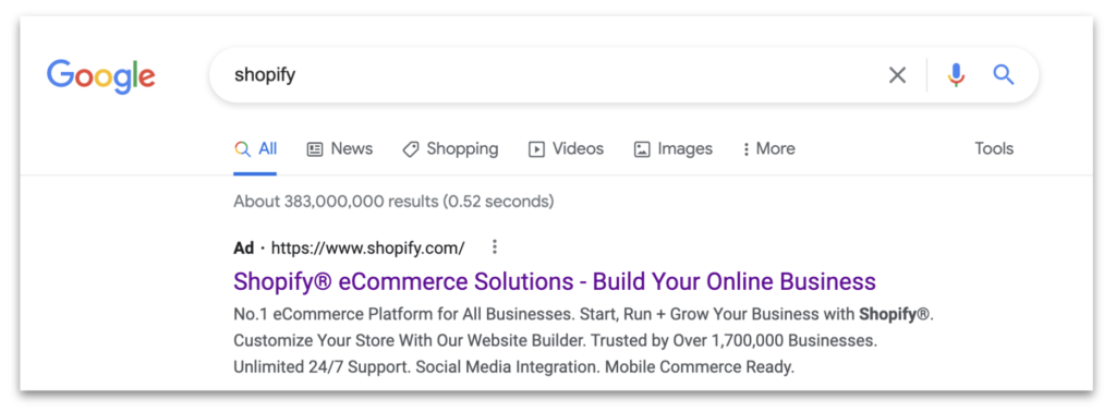
People go to Google and type in Shopify. They’ll often see an ad like this:

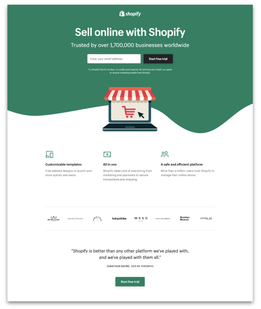
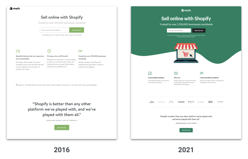
If they click that link, they’d arrive at this landing page: shopify.com/free-trial:

This page is valuable real estate. In fact, it’s the largest driver of leads, prospects, and merchants. About 61% of SEM traffic gets sent here, accounting for $150,000,000 of ad spend.

The complication

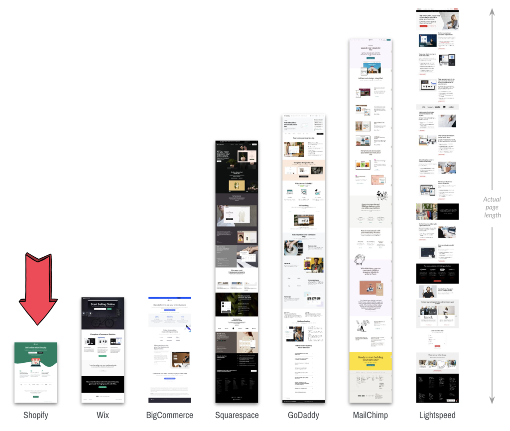
The /free-trial landing page was outshined by the competition. It was 76% smaller than the average competitor landing page.

This page was also outdated, remaining largely unchanged since 2016:

The question

How do we modernize this landing page?

The answer

We reimagined this page with a greenfield approach.

In many disciplines, a greenfield project is one that lacks constraints imposed by prior work. 

The analogy is to that of construction on greenfield land where there is no need to work within the constraints of existing buildings or infrastructure.

From Wikipedia

To succeed, Shopify needed to create a bold, new landing page from the ground up, all at once. It was a shift from slowly iterating on a page over time to launching a vibrant, right-sized page from the start.

The process

I led this project overall, from timelines to resources to leadership reviews. We kicked off the creative work with the process of crafting three new concepts, each with a different user need. Starting with the greenfield blank slate, I first set each concept intention, then outlined the information architecture, paired with a visual designer, and crafted the page content.

Working with a UX research team, I helped run the concepts through two rounds of user research to ensure that our work was based on real users in real situations.

The work: Three concepts

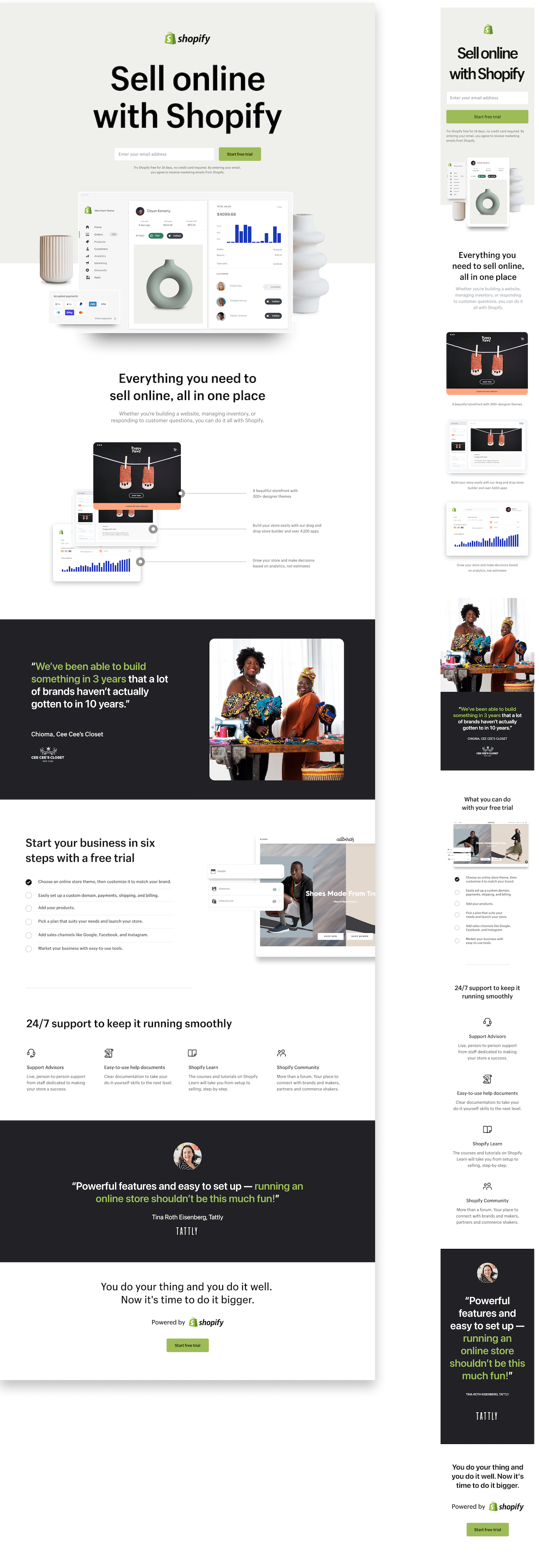
Concept one: This is Shopify.

Research showed that people seek specific information before committing to a free trial. None of that info was on the control page, so we put it in this page template.

  • Includes the most info of all three concepts
  • Retains the same top-level messaging as the old page
  • New emphasis on support to build merchant confidence
  • Adds the detailed the step-by-step setup process

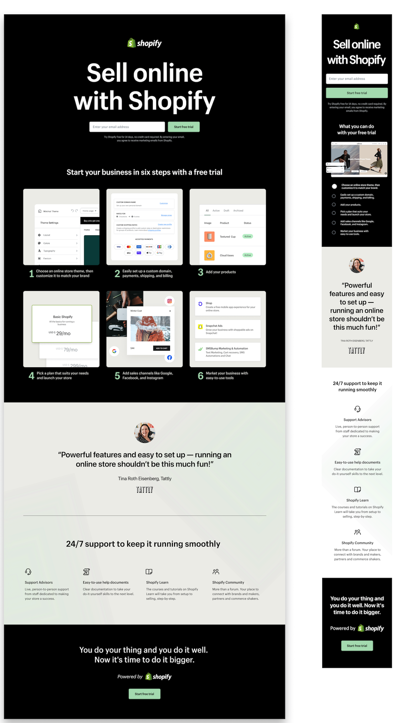
Concept two: A successful business starts with a free trial

This concept features less information, but still includes the top-requested elements from the UX research.

  • Focus on the steps to get started, from a free trial to selling
  • The most compact concept

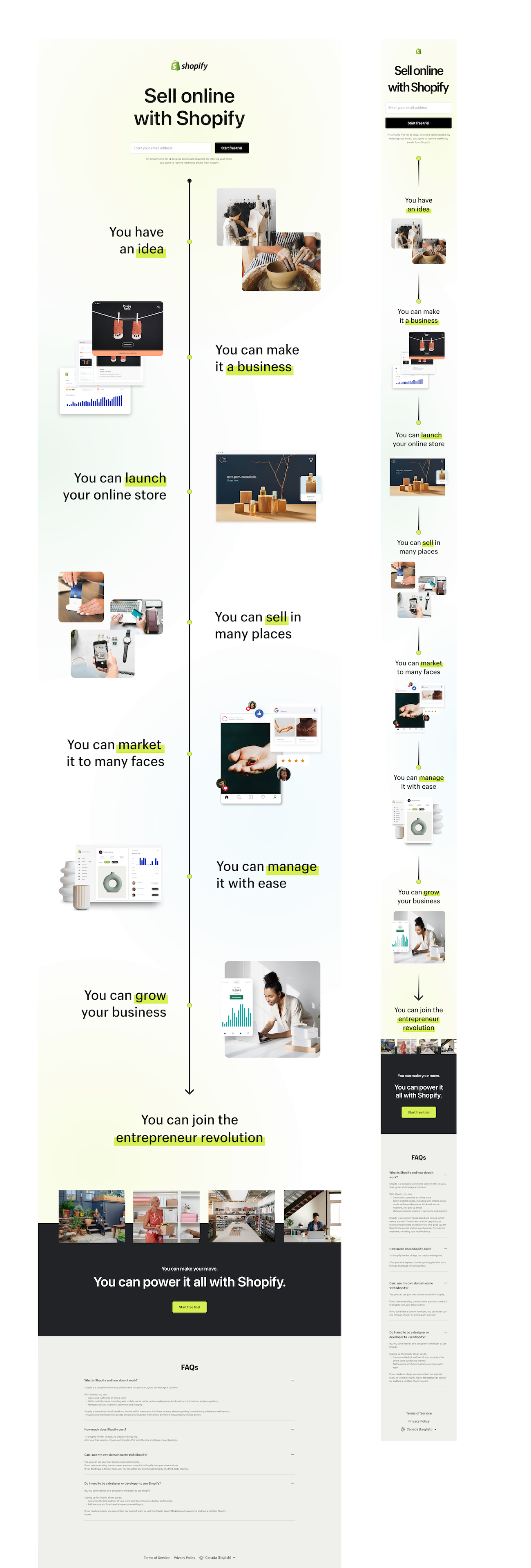
Concept three: Manifesting for merchants

This was the biggest departure of the lot, discarding almost all of the past versions for a bold, new presentation.

  • Focus is on building merchant confidence
  • Emphasis on conversion, rather than providing info
  • Broke free of past guidelines and followed a more narrative approach

The experiment

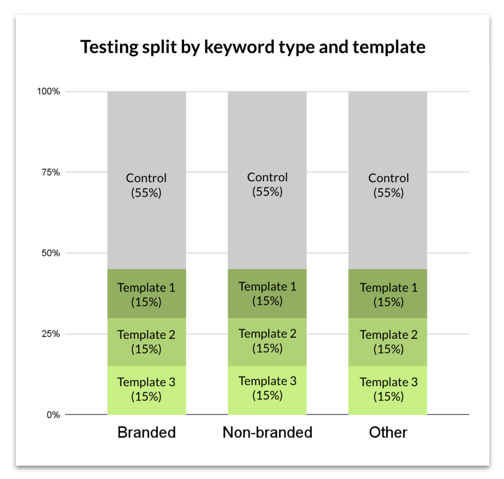
A shift like this is a risk, so we carefully tested our new concepts in an experiment along with the control. I worked with a Growth Marketer to fine-tune the test, splitting it out by template and keyword type to provide detailed insights.

The results

The third template was the winner, though a full roll-out wasn’t initiated after the results came in. It was rolled out in certain markets where it outperformed the control group.

One of the biggest outcomes of the project was establishing a new way of working, with content design leading the proceedings. We demonstrated the value of content design to a new working group, and elevated the discipline to a new level. At the project close, we had earned our seat at the table.

Shopify: Merchant-to-merchant referrals

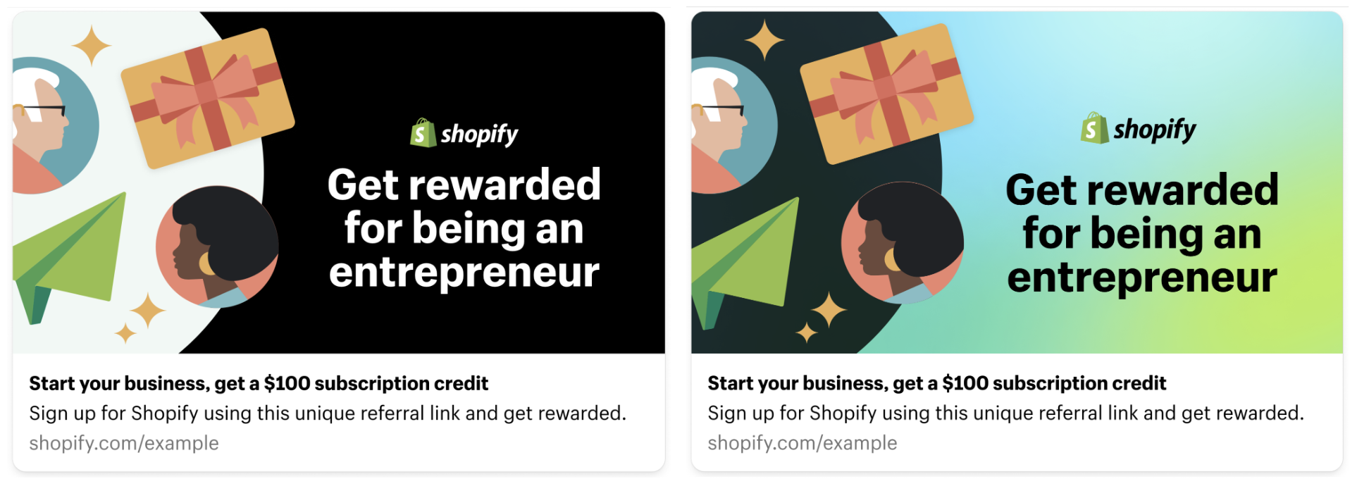
Merchants are great lead generators, so we created a end-to-end merchant referral experience from an initial CTA through reward redemption notification.

My role: Content design lead, UX/visual designer partner, QA partner.

The situation

Shopify merchants often refer their friends and family to the platform based on their satisfaction with it. These referrals are more likely to be successful than a merchant that signs up via the standard pathways (i.e., landing pages, homepage visits, etc.)
The complication

There wasn’t a mechanism in place that allowed for an explicit referral to happen, and no incentive for merchants to initiate a referral.

The question

How can we support merchant referrals and incentivize both parties?

The answer

By designing an experience and user flow that supports the referrer and referee through the entire process, and rewards both of them for opting in.

The process

This program has a transactional component to it, so user interactions happen on both public-facing pages and pages behind a login in the merchant admin panel. This requires navigating two surface parameters, style guides, and functional teams.

Once the team outlined the user flows, we started the design work. We used some existing templates, and created others just for this project.
The referral program is multi-layered, requiring a series of referrer and referee actions to take place in order to trigger the incentives. The limited space in the merchant admin panel and style guide constraints made the content crafting process a complex affair.
The work

Surfaces included:

  • Admin panel content in multiple locations, each with different contexts and messaging
  • Landing pages for both referrers and referees
  • Messaging in onboarding emails sent to every new merchant
  • Program-specific emails about reward availability and redemption
  • Social content
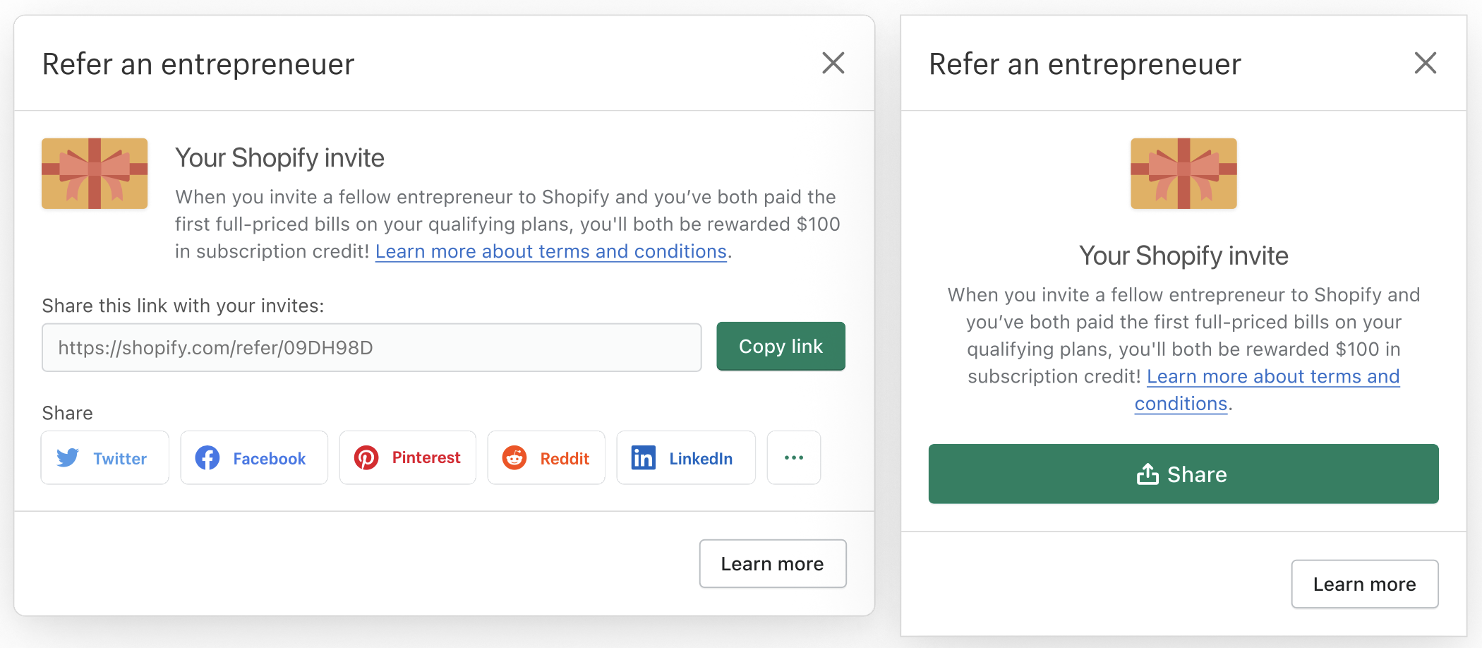
Invite that merchants see within the admin panel
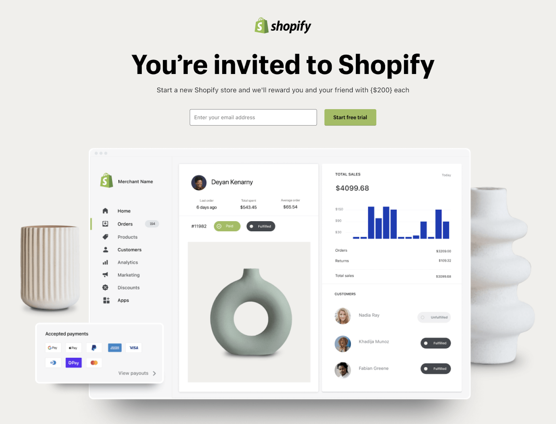
Landing page for referees
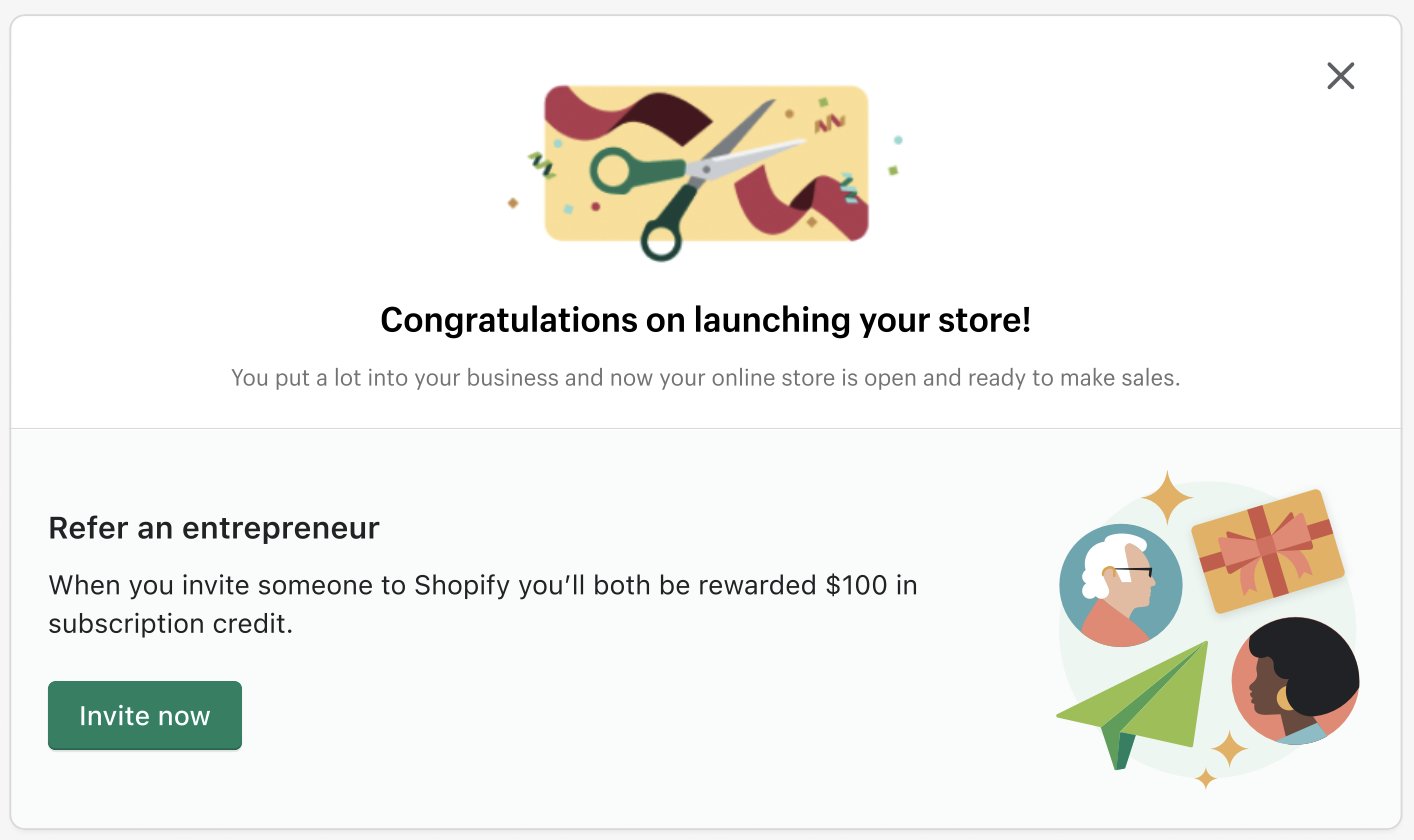
CTA attached to a store launch message in the admin panel
Social content

The results

The program has been a wild success, with referrals coming in at roughly twice the forecasted rate, even after a price increase on Shopify plans.